Security protects people. Confusion scares them.
OTPs, biometrics, device checks and approvals all add friction. The job wasn’t removing them. It was helping people understand why they exist.
 Sarim Naeem
For five years I led the UX of Alfa, one of Pakistan’s largest digital banking apps. I took it from an agency-built app to an open, lifestyle super app, then rebuilt it again as the market caught up. This is that story.
Figures reflect internal reporting during my tenure (2018–2023) and are team results. I was one of many people behind them.
They opened it because something important needed to happen.
Behind every screen was a real person trying to solve a real problem. That realisation changed my career. Before Alfa, I thought design was about screens. Alfa taught me people don’t remember screens. They remember certainty, confidence, and whether the product quietly helped them do what they came to do.
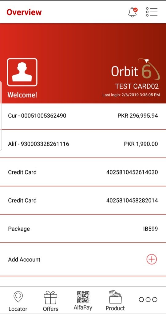
The agency app opened on a plain list of account numbers behind a red banner. Every task lived somewhere else, and you had to be registered before you could see anything at all.
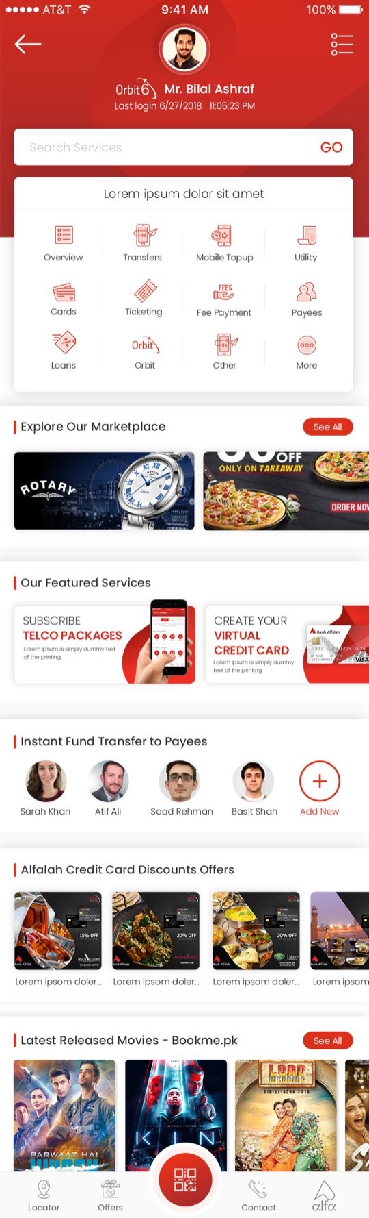
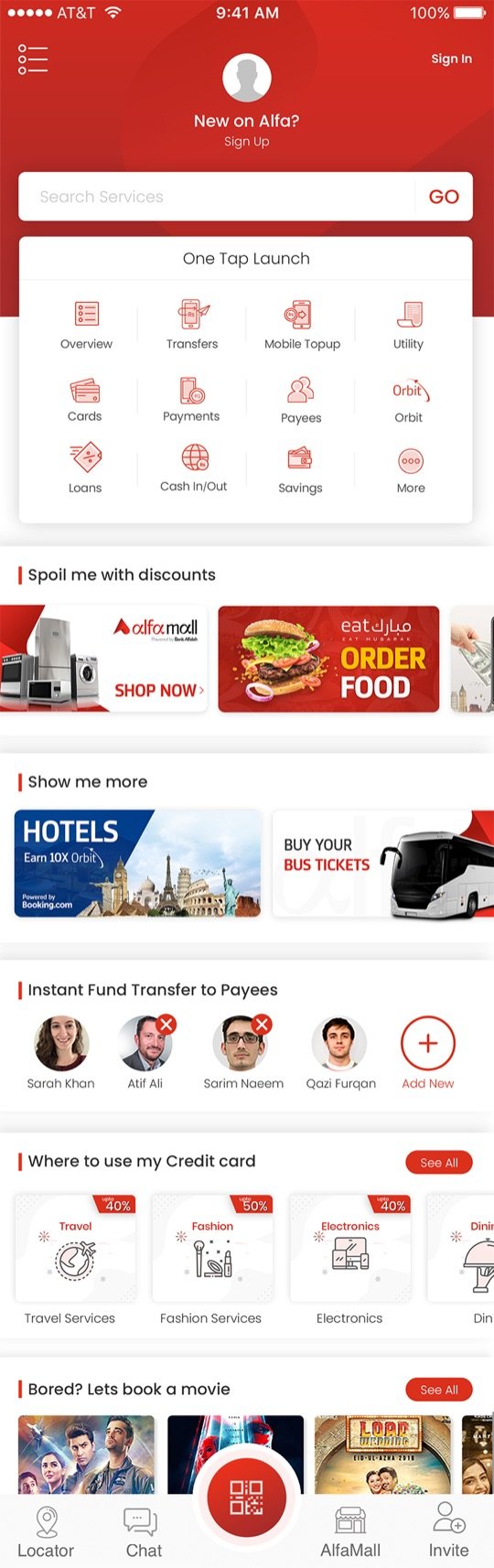
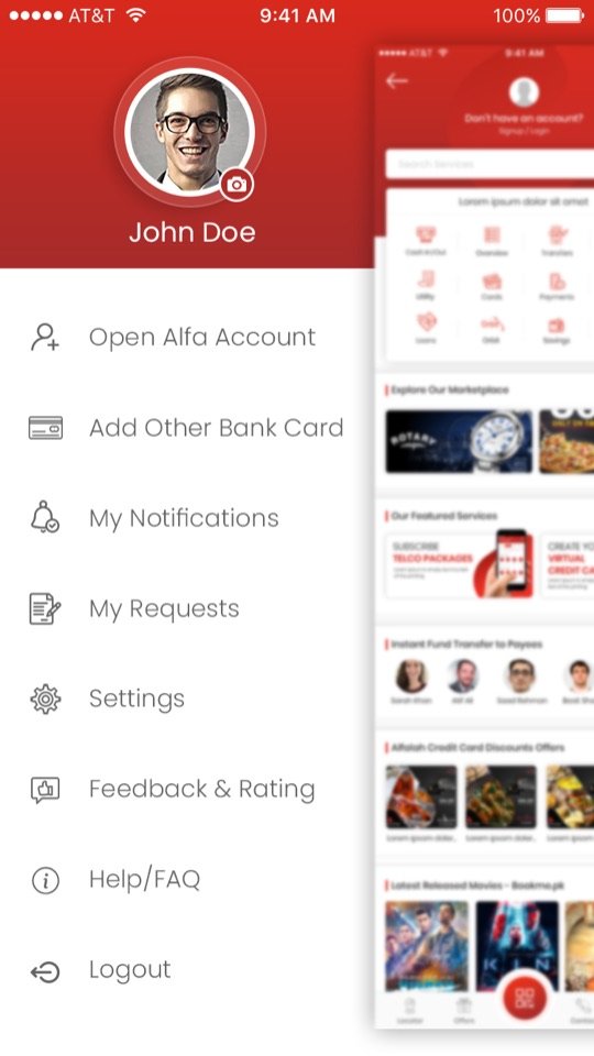
Gen 1 turned the first screen into a destination. Anyone could explore it without logging in. A “one-tap launch” grid put everyday tasks upfront, and lifestyle rails turned banking into a place people visited.
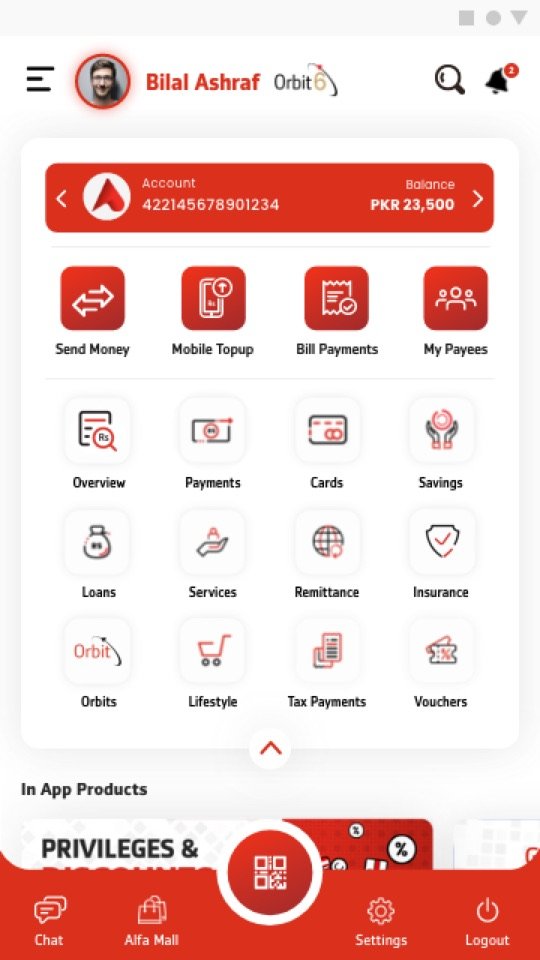
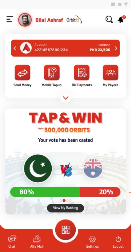
By 2020 every bank was in the UI race and users were telling us the home screen felt crowded. Gen 2 kept only what people did daily: one account card, four actions, and everything else one tap away in grouped menus.
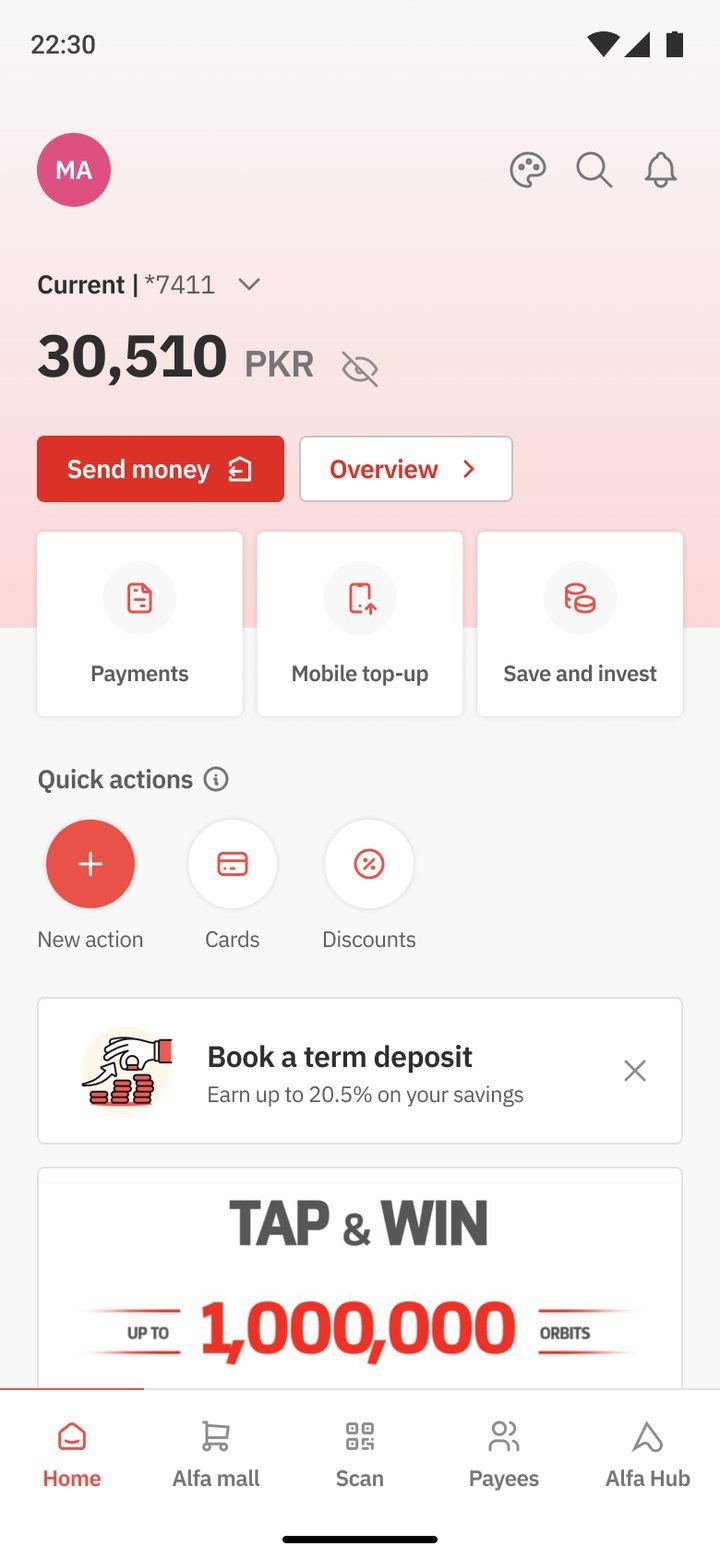
The flagship kept Gen 2’s calm and fixed what the audit found. The balance comes first and stays hidden until you tap. Daily actions come next, then quick actions each customer picks. Themes and dark mode run on one design system, built on the work of Gen 1 and Gen 2.
When I joined in 2018, Alfa was already live, trusted, and moving money every minute. It had been designed by a marketing agency on basic UI rules. Stakeholders were drawn to how screens looked more than how they worked.
That changed the nature of design. Moving navigation didn’t just move icons, it changed habits. Adding security wasn’t just another screen, it changed trust. And removing a step could increase customer mistakes. Every decision carried consequences.
A banking app with a login wall only serves people who already chose you. We wanted Alfa to win the ones who hadn’t, so the first revamp opened the door.
People downloaded Alfa to look around and left before they ever saw what it could do.
An “Open App” where anyone can browse services, offers and products, then sign up from any moment of intent.
Alfalah’s USP was lifestyle services inside a financial app, so the home became a super-app dashboard.
A search bar and a “one-tap launch” grid for daily tasks, with instant transfers to favourite payees. Below them, rails for discounts, travel, tickets and card offers gave people a reason to come back even when they didn’t need to pay anything.
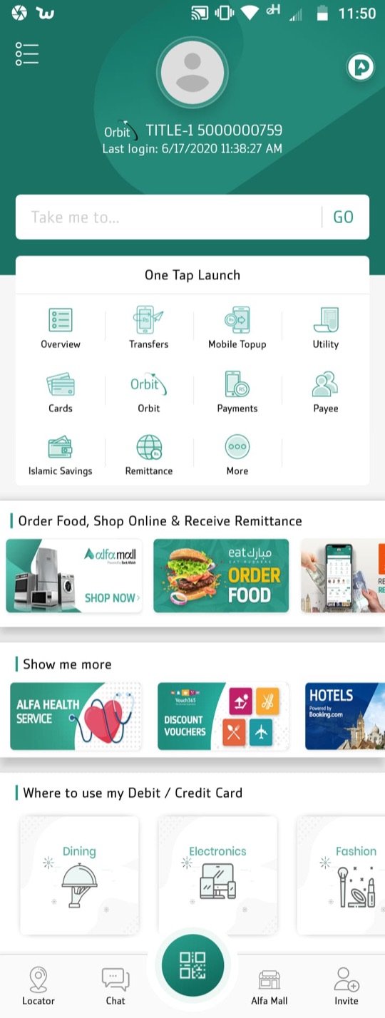
Design choice — the first screen should answer “what can I do here?”The same product had to feel right for very different customers. I designed themeable experiences: Alfalah red for conventional banking, a calm teal identity for Islamic banking (with its own Power Pack), and a premium tier for Premier clients.
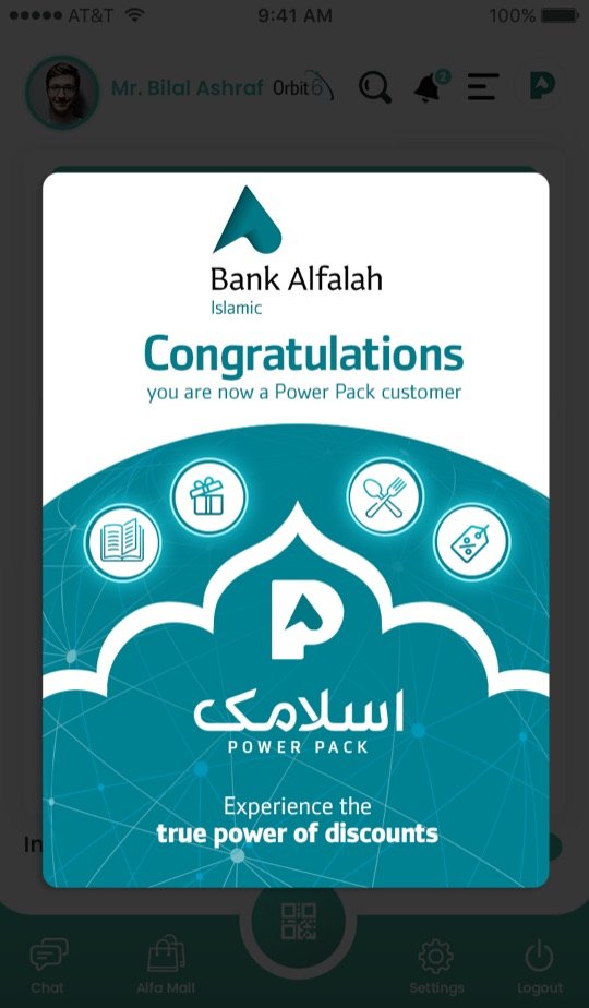
Business teams needed numbers. My job was to help them hit those numbers through the experience, not in spite of it. Virtual cards, investments, goal-based savings, remittance, QR, insurance, loans, tickets, loyalty and gamified acquisition all shipped inside one app.
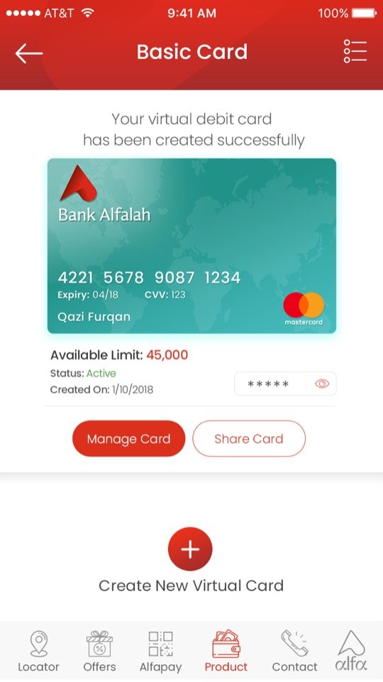
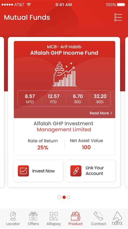
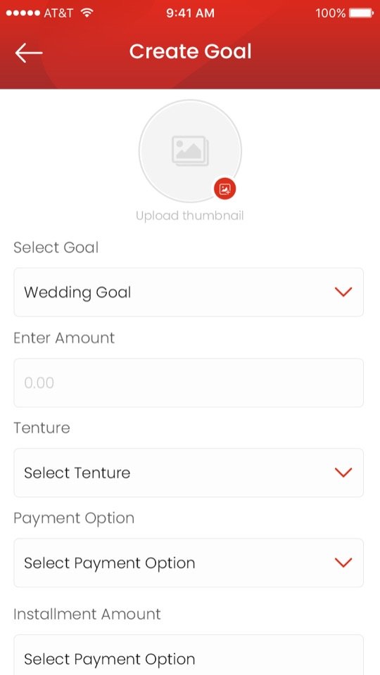
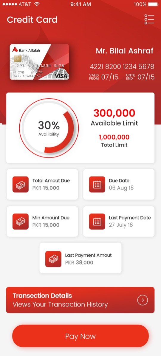
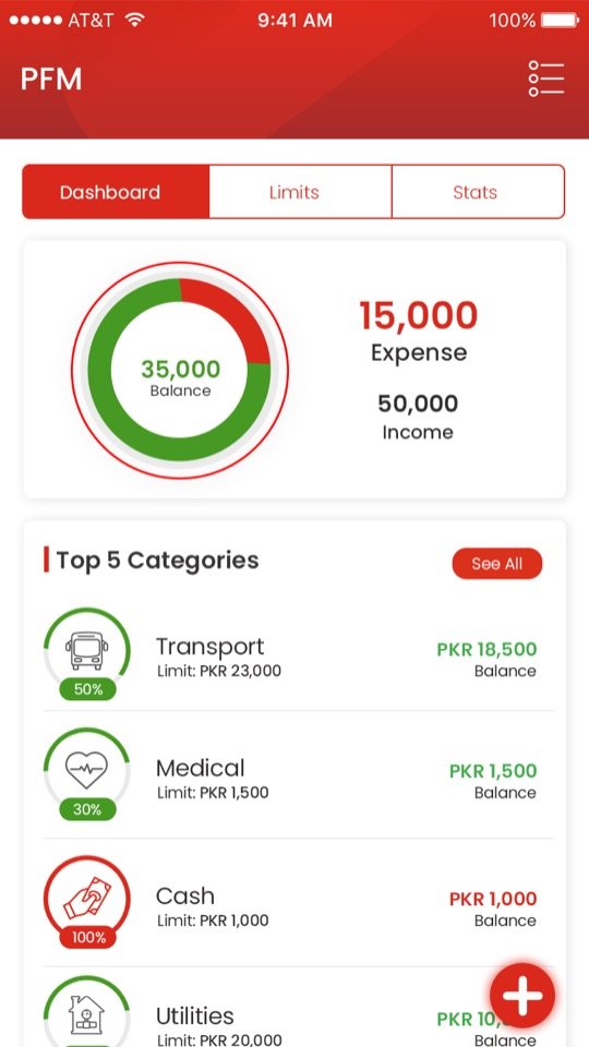
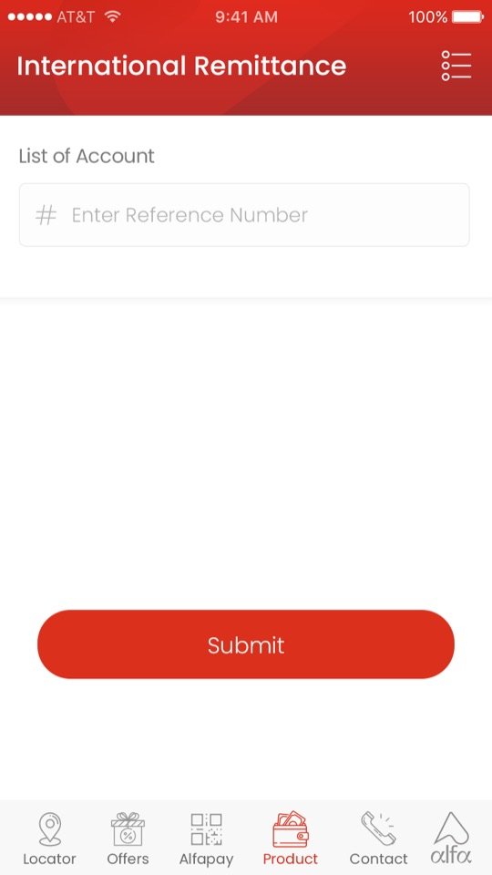
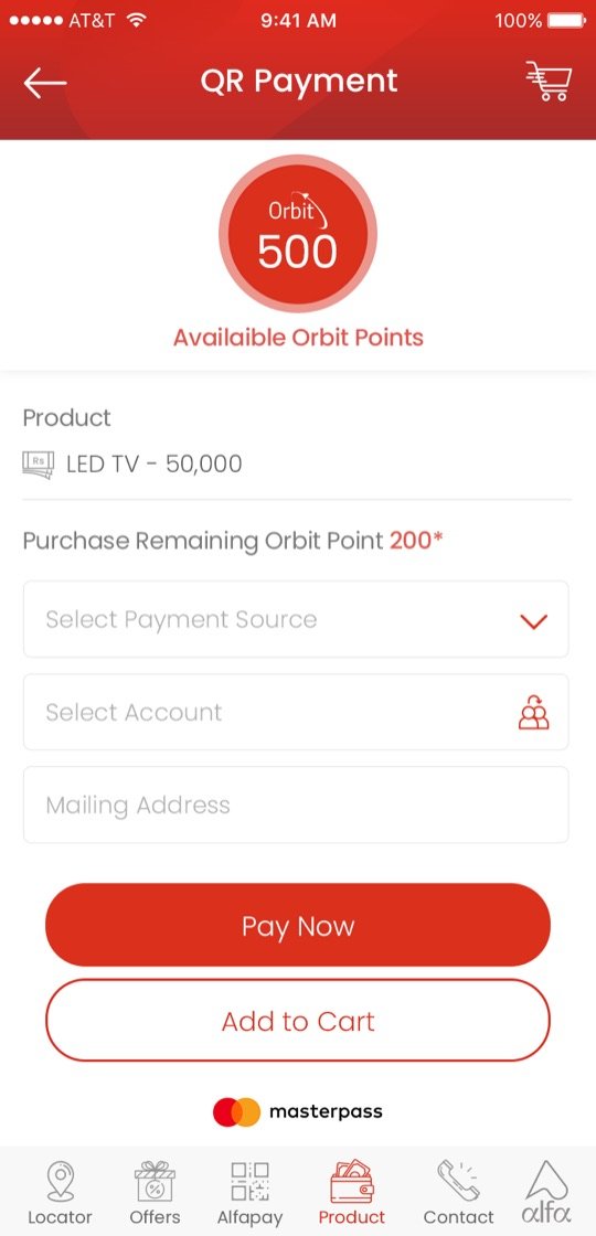
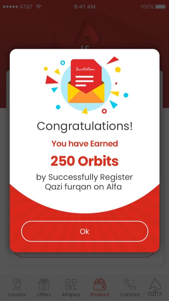
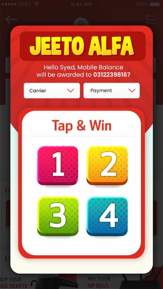
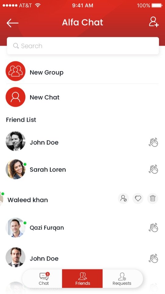
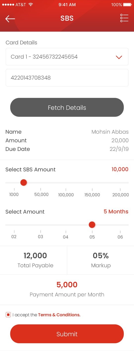
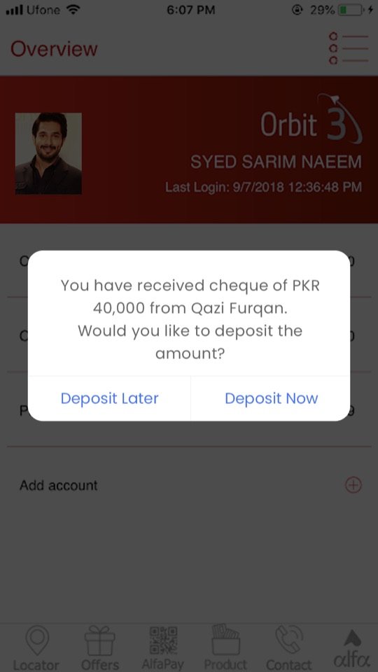
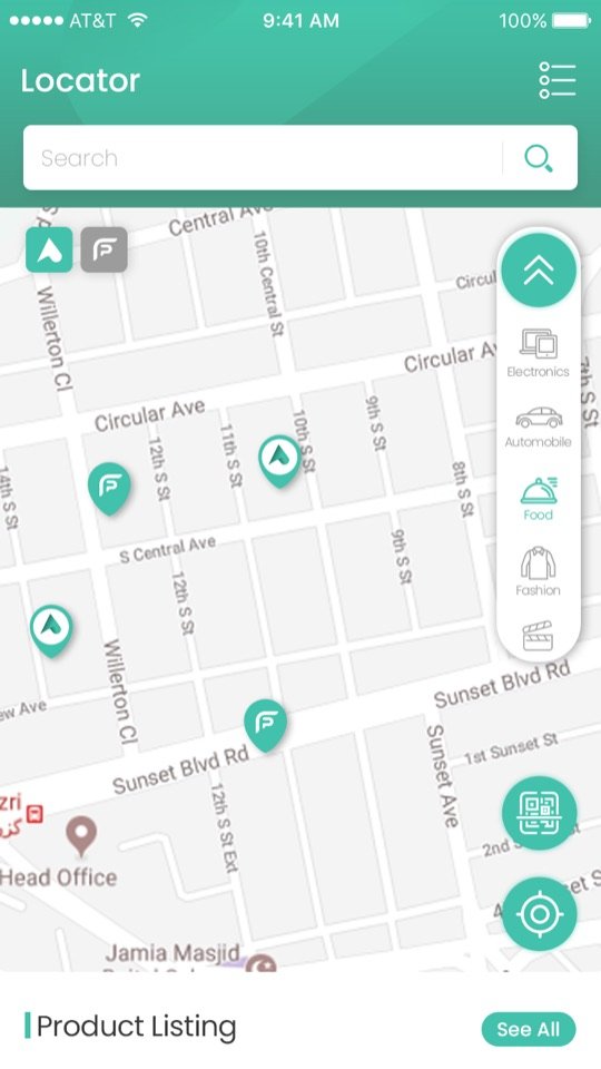
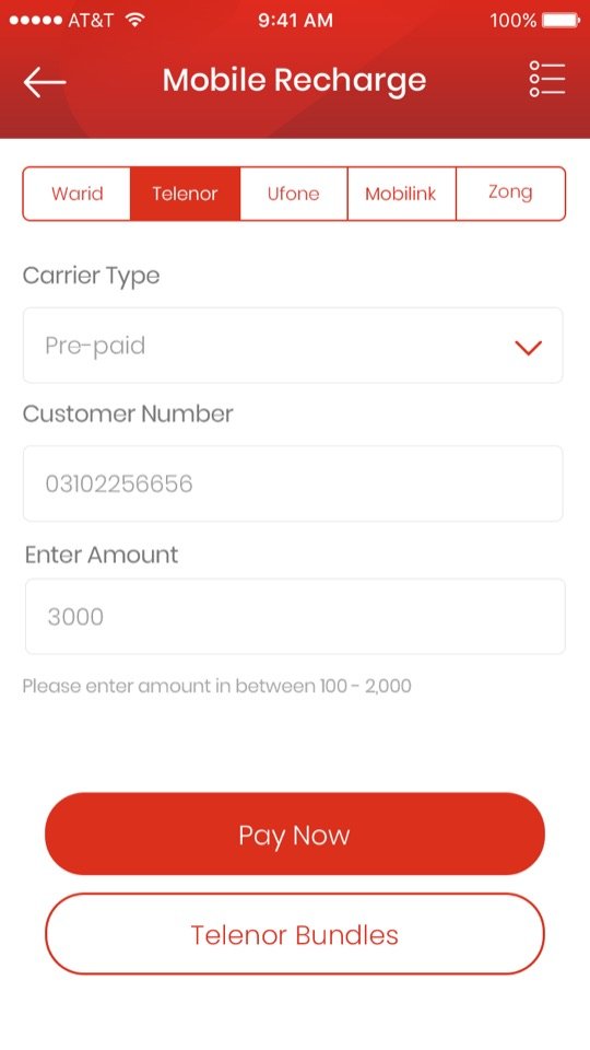
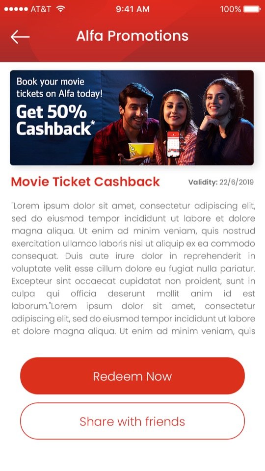
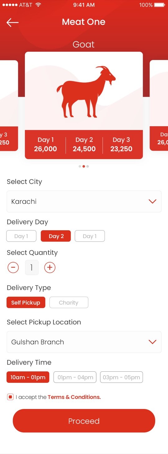
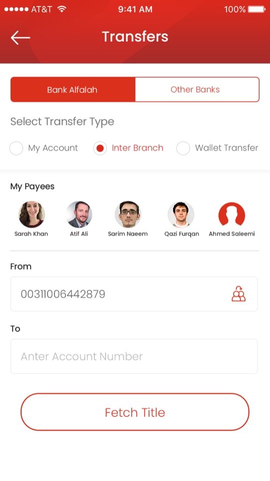
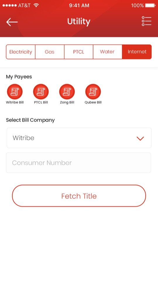
Polished case studies rarely show what happens behind the interface. At Bank Alfalah, design became the language that connected all these moving parts, and I learned to speak with each of them.
“How do we make this screen better?”“What is this person trying to achieve?”
Somewhere along the way my definition of UX changed. Nobody wakes up wanting to use a banking app. They want life to continue: salary, transfer, bill, card, loan, receipt. If users noticed the interface, we had probably failed.
Digital banking was booming in Pakistan and every bank was competing on UI. We had grown fast, and the home screen showed it. This time we started from what people told us, not from what we wanted to add.
Customers told us the dashboard felt crowded and that everyday tasks took too long to reach.
We worked with data teams to see which features people actually used, and designed around that.
Local banks, wallets and global neobanks, to find the gaps worth closing and the patterns people already knew.
The new home led with the thing people checked most: their account and balance. Below it were the four actions they used every day: Send Money, Mobile Top-up, Bill Payments and Payees. A single expand control revealed the full service grid, and promotions moved below the fold.
Design choice — show the daily path, hide the long tail (but keep it close).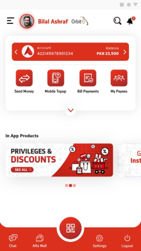
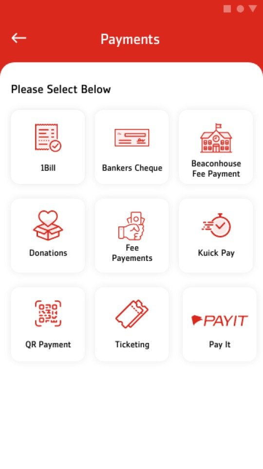
Instead of one long alphabetical list, services were grouped into Payments, Save & Invest, Loans, Lifestyle, Insurance, Vouchers and more, so people could scan for the right category first.
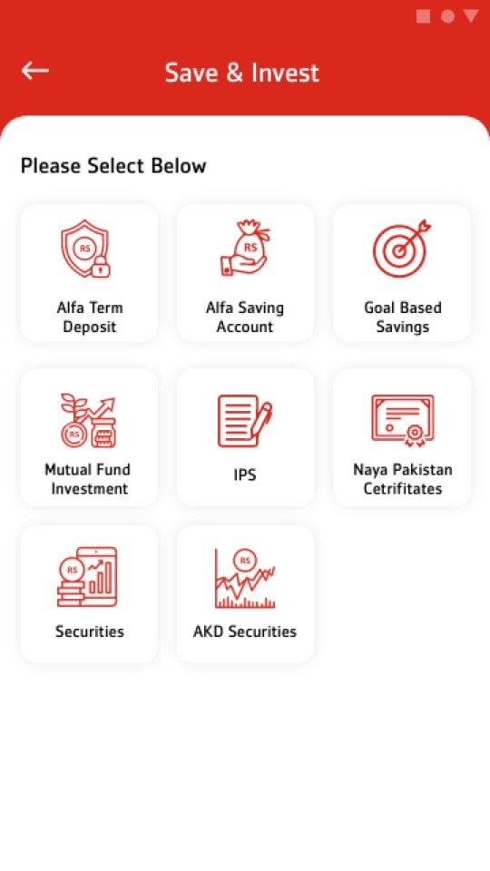
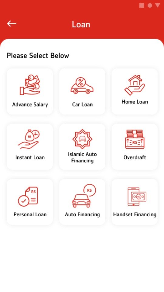
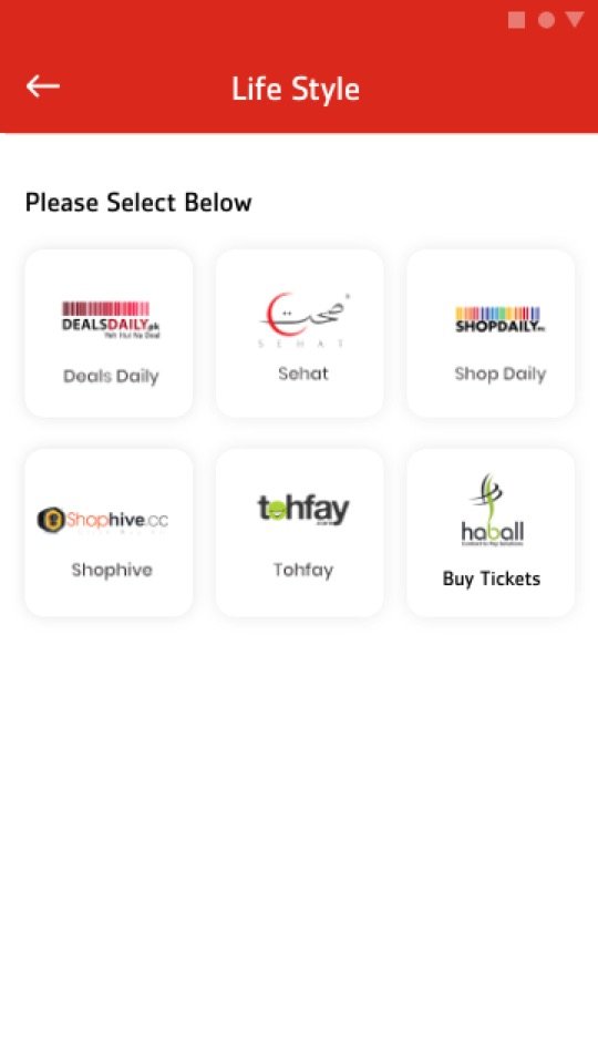
In parallel with the revamp I kept designing new products for business teams: instant loans, BNPL, NFC card management, mutual funds, term deposits, prepaid cards, CNIC-based Asaan Pay and gamified campaigns. Each one had to fit the new system instead of bolting on its own.
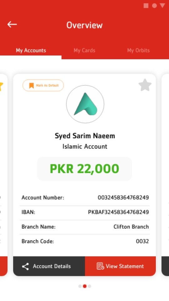
Growth hides problems. So ahead of the flagship rebuild, the bank brought in an external UX team to audit Alfa app and web.
Four experts ran a heuristic evaluation across onboarding, navigation, payments, cards, lending and investments. They scored each area against usability principles and compared the results with the SUS benchmark of 68. They read hundreds of Play Store reviews and benchmarked us against a direct competitor. The scores were humbling, and that was exactly the point.
The audit didn’t erase five years of work. It showed us where the next five years should start.
The flagship was a revamp, not a restart. With external consultants we built a new design system, visual language and navigation. Most of the UX underneath came from work we had already shipped and tested: the themes from Gen 1, the account-first home and grouped services from Gen 2, biometric onboarding, virtual cards and the payee flows. The same core team carried it. After the consultants handed over, I left Bank Alfalah in November 2023, and the team took it through development to launch in October 2024.
We didn’t throw away five years of decisions that customers already understood. We gave them a cleaner system to live in.
The audit said the home was doing too much. The flagship home starts with the balance (hidden by default, one tap to reveal), then Send money and Overview, then the three things people do most. Below that is a row of quick actions that each customer picks, so the home grows around their habits instead of the bank’s.
Design choice — let people decide what’s “quick”.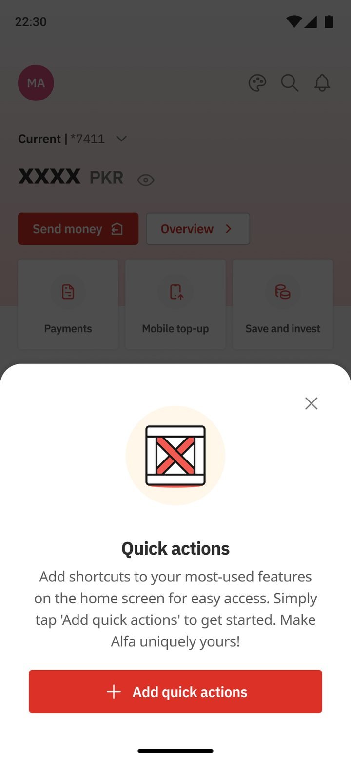
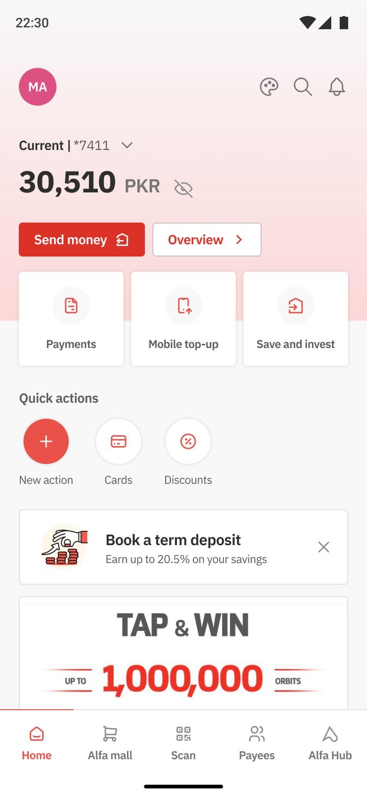
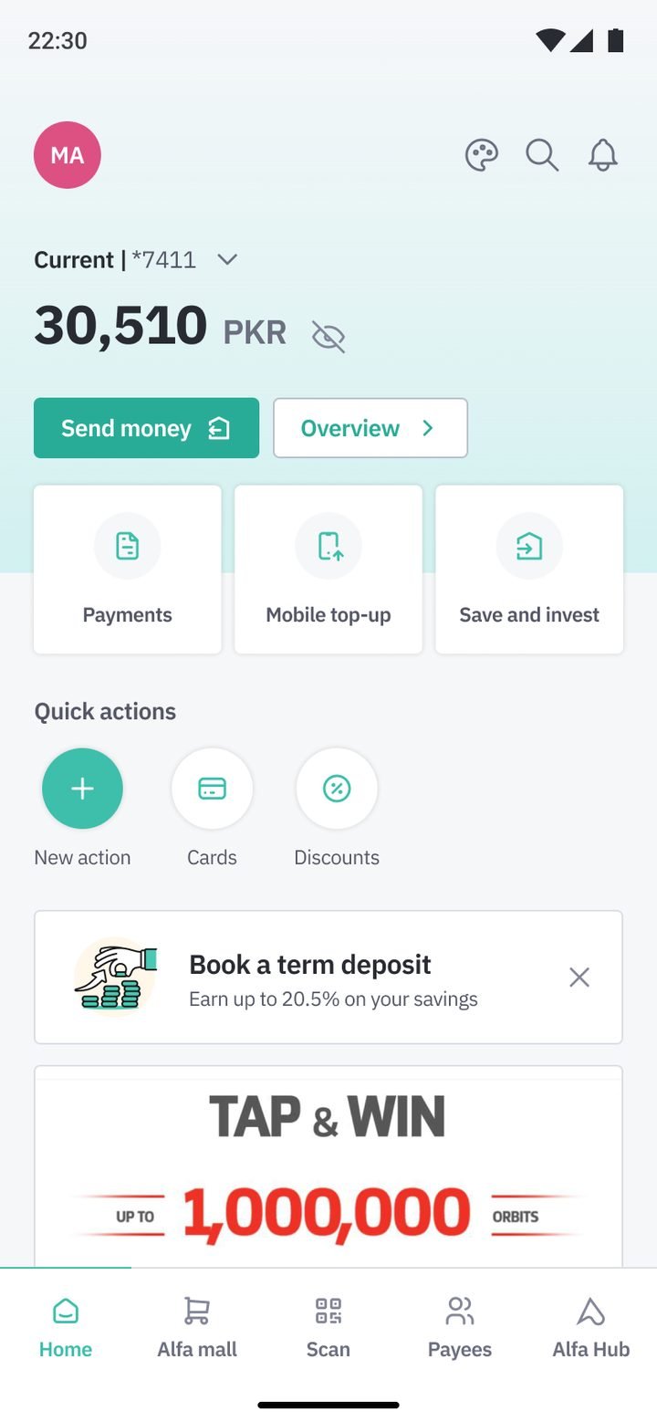
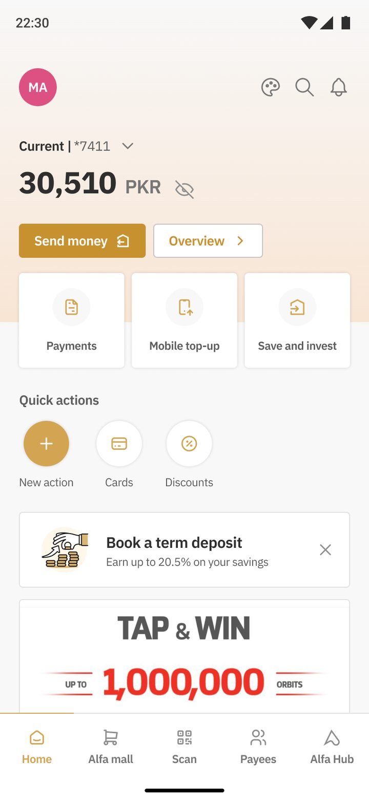
Gen 1 proved that customers wanted to feel at home. Gen 3 turned that into tokens: one component library with colour themes for Conventional, Islamic and Premier customers, plus a full dark mode. A new theme became a set of variables, not a new set of screens.
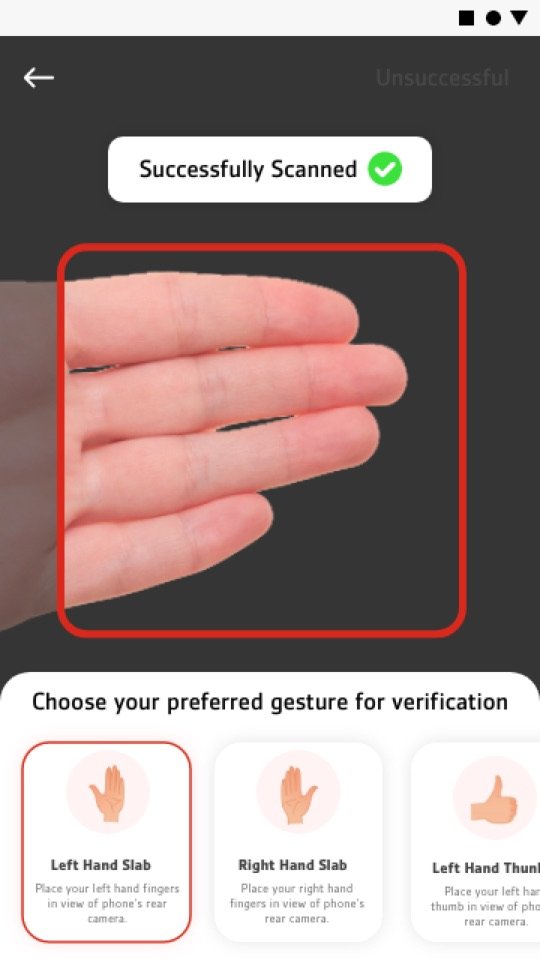
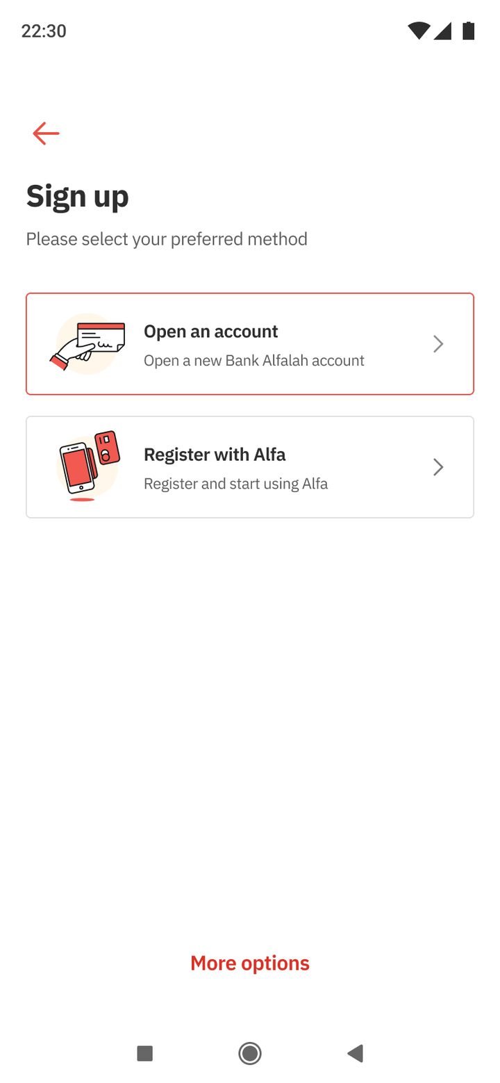
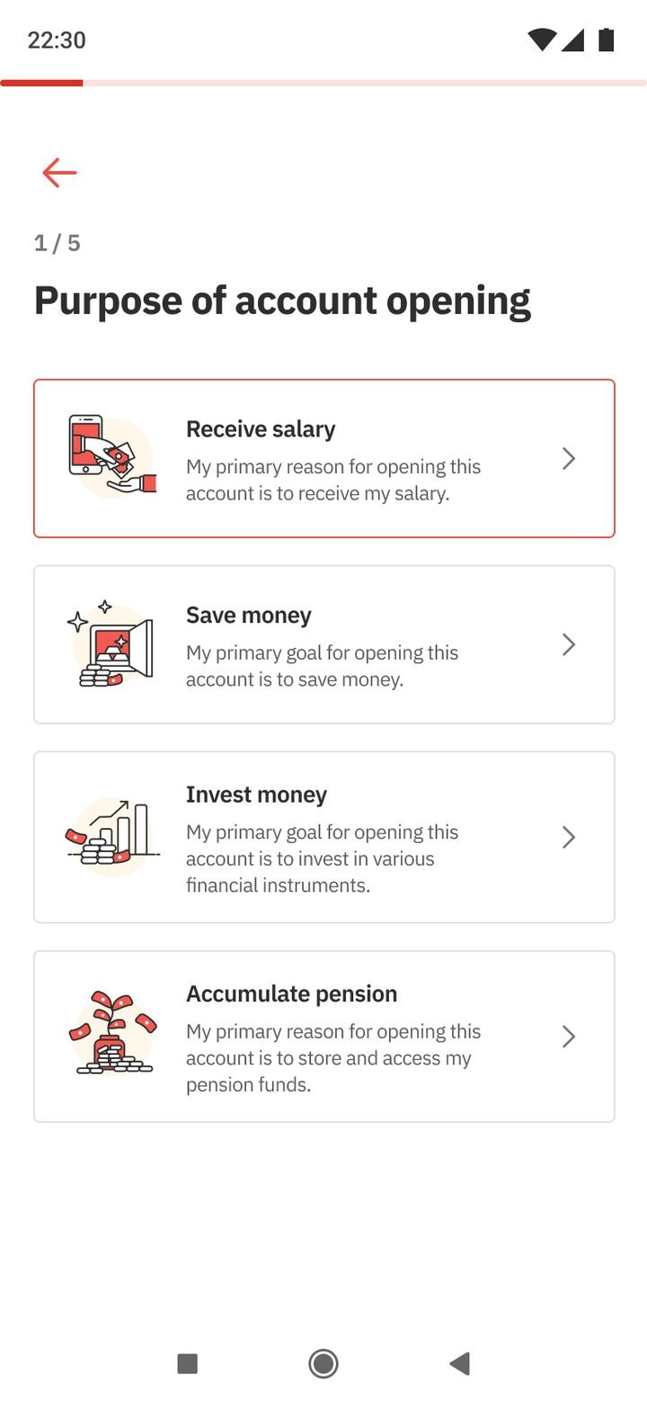
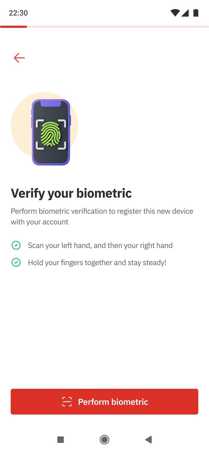
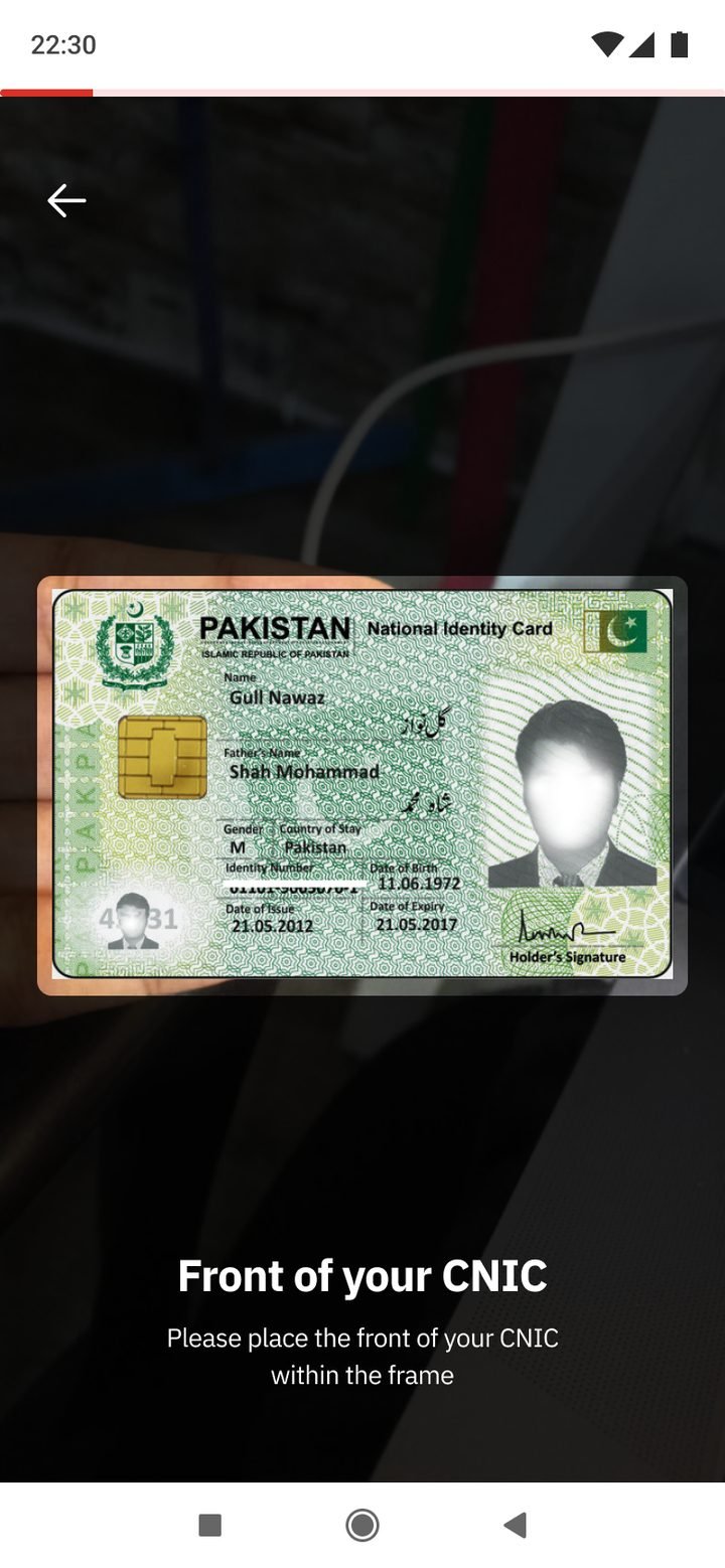
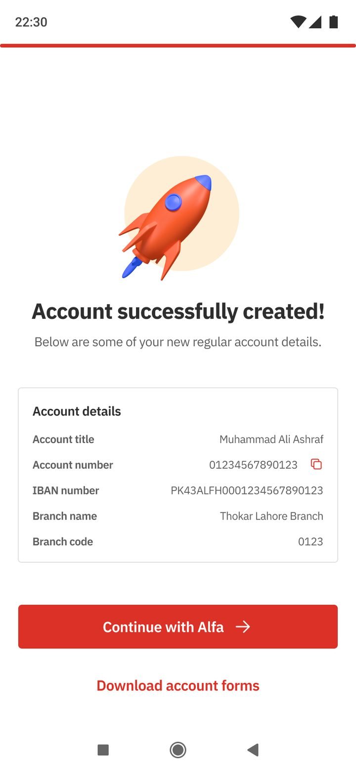
The audit found that opening an account digitally still meant registering separately afterwards. The flagship joins them: choose a path, say what the account is for, verify with a fingerprint and CNIC through NADRA, and finish with an account that is ready to use in Alfa straight away.
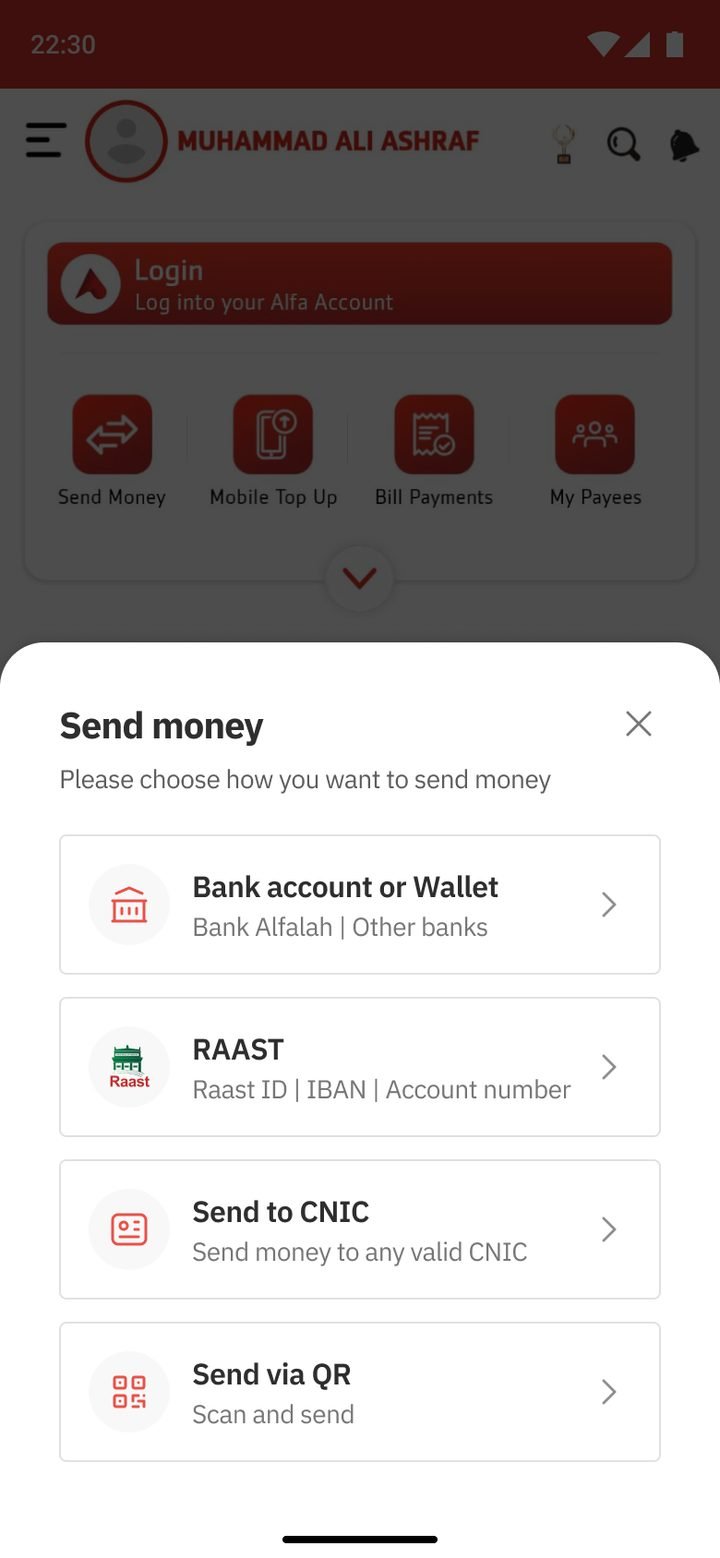
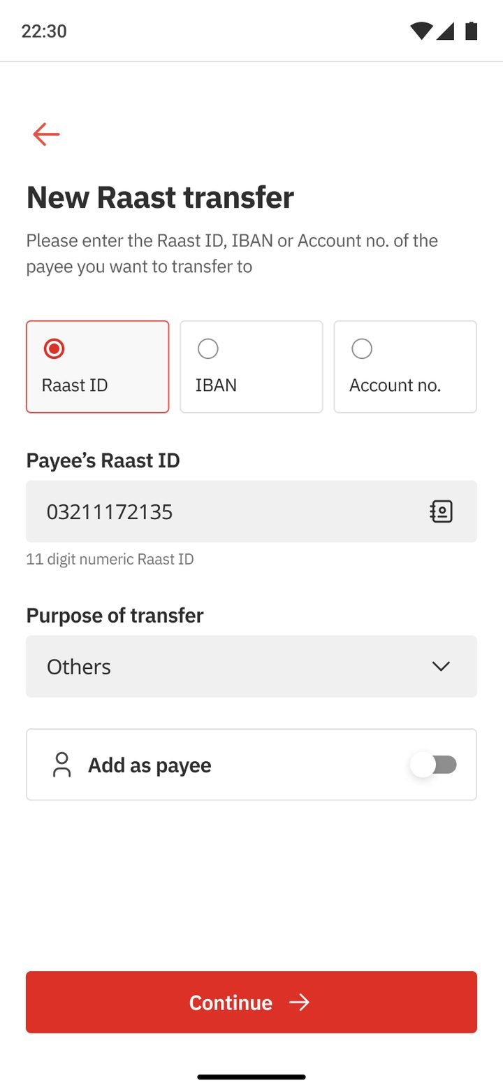
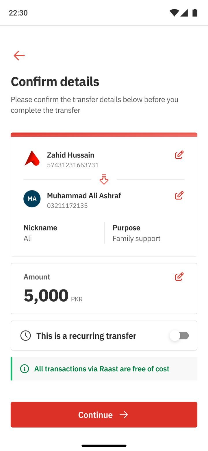
Every way of sending money follows the same four steps: choose how, choose who, check the details, and get a receipt you can share. Raast transfers show that they are free before you confirm, so the cheapest option is also the obvious one.
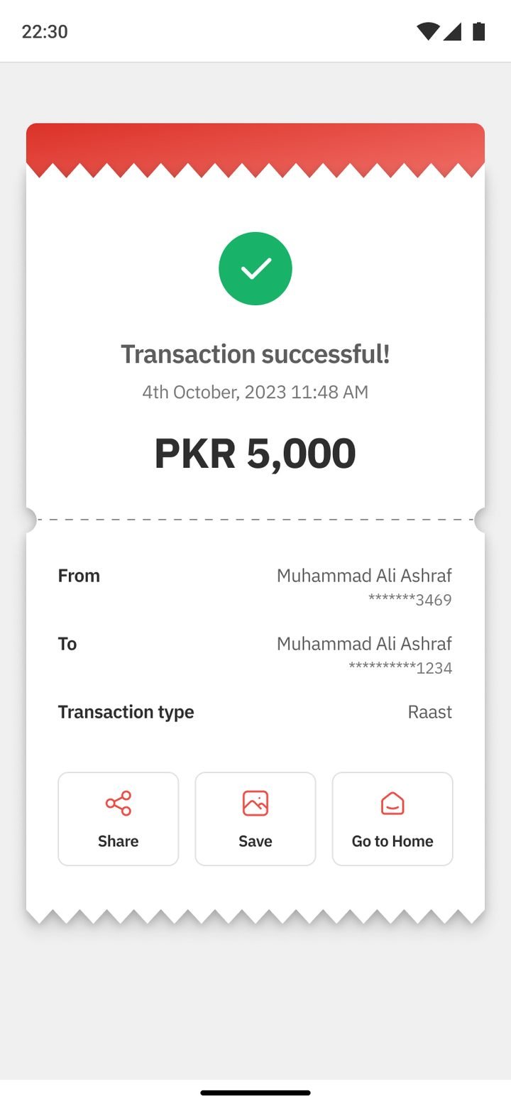
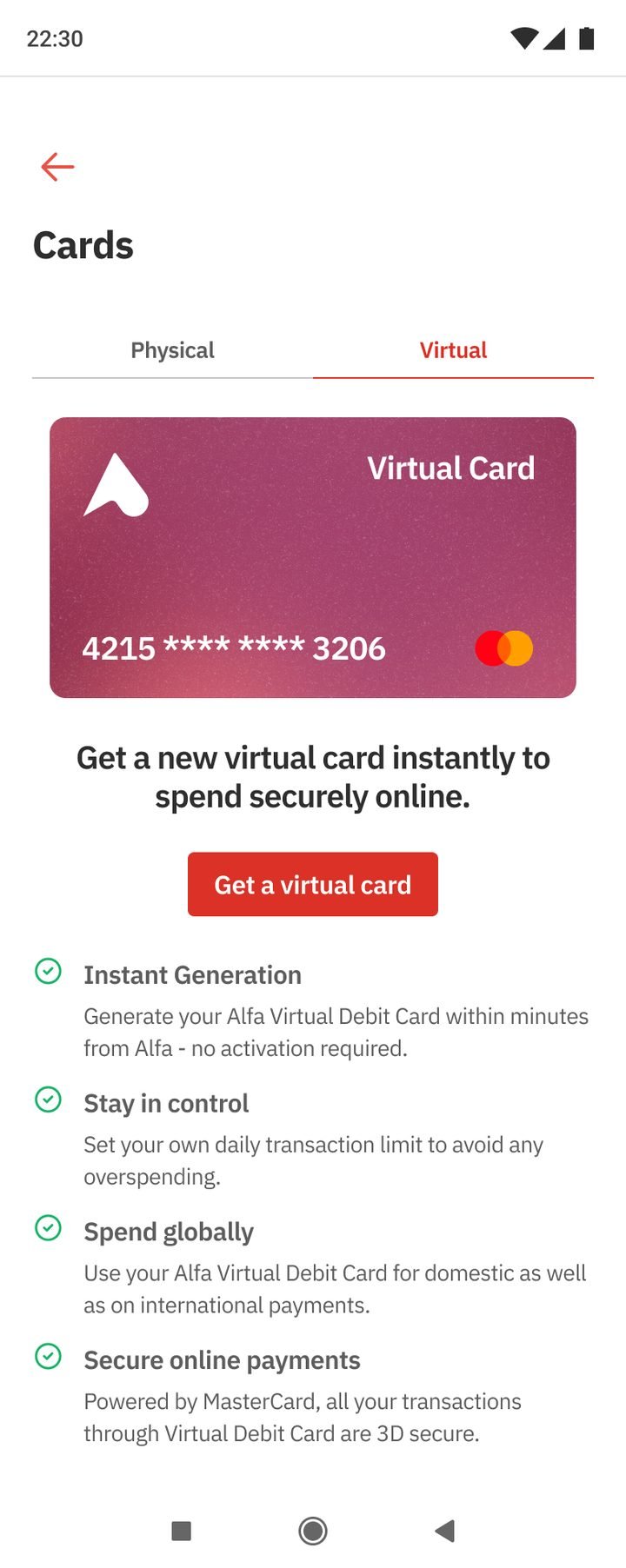
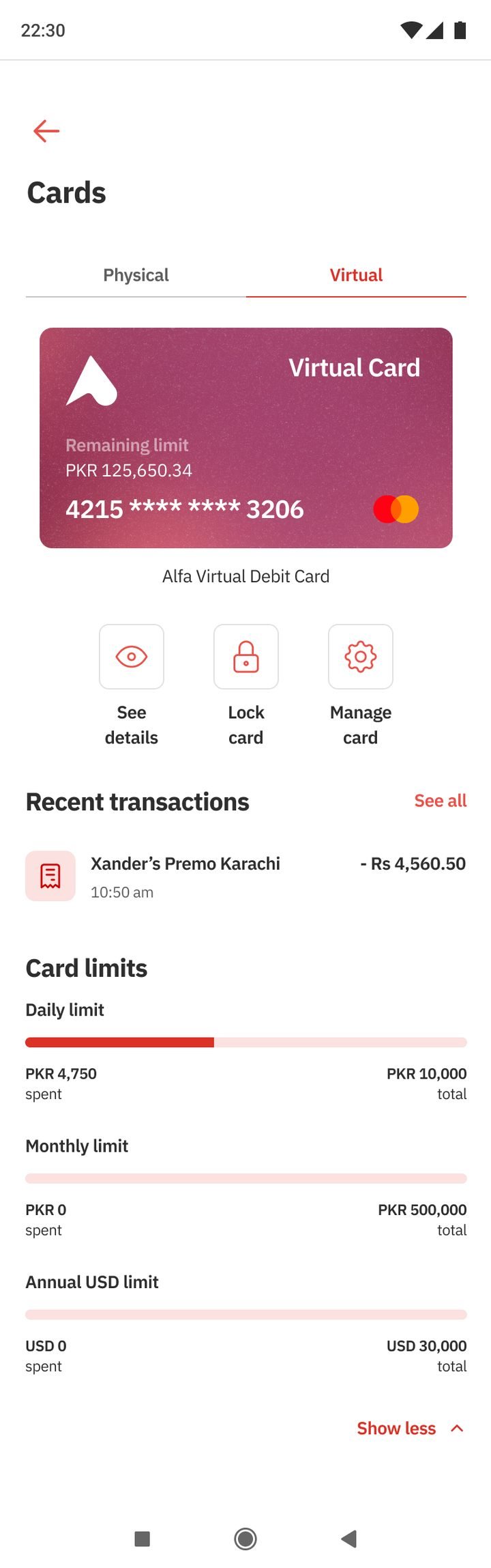
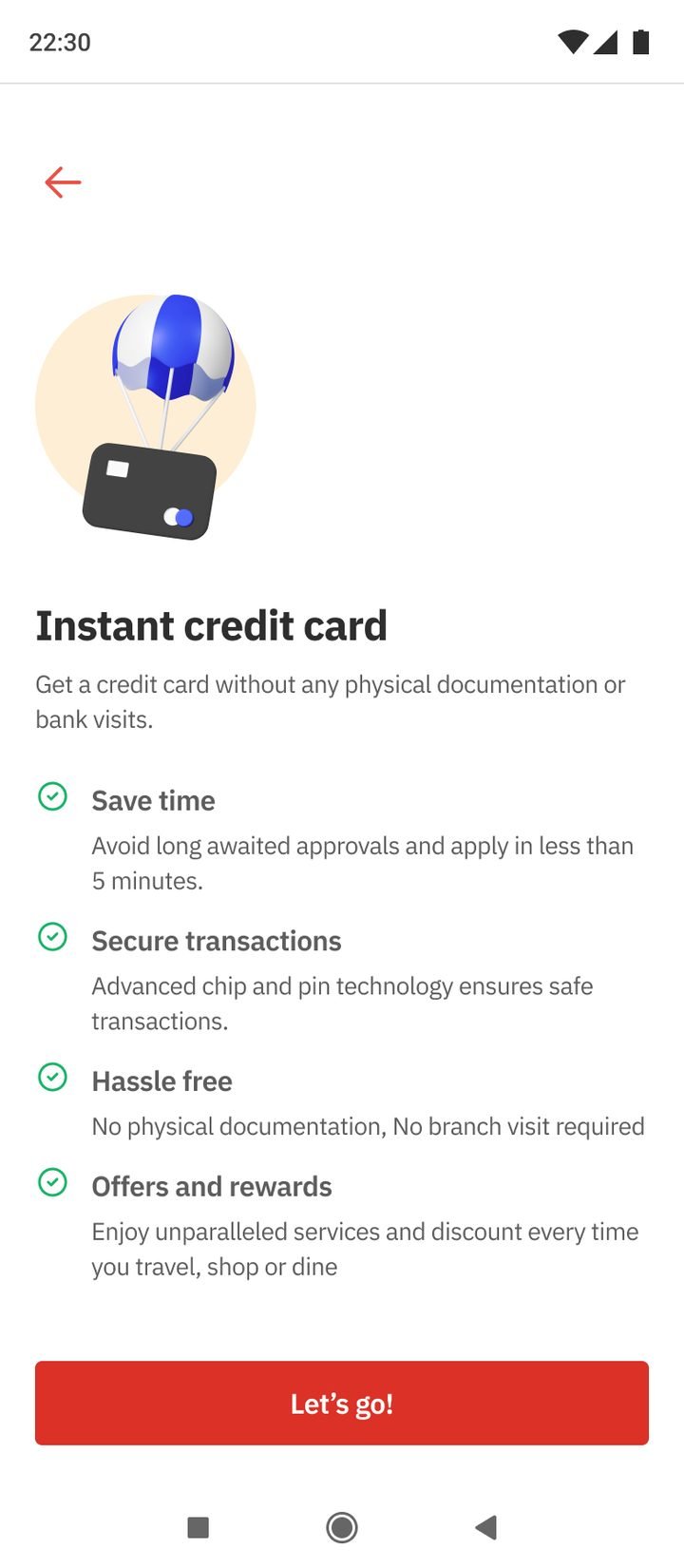
Virtual and instant credit cards, card controls, transaction limits, Alfa Hub, dark mode, a branch locator and a new profile were all built from the same components and patterns.
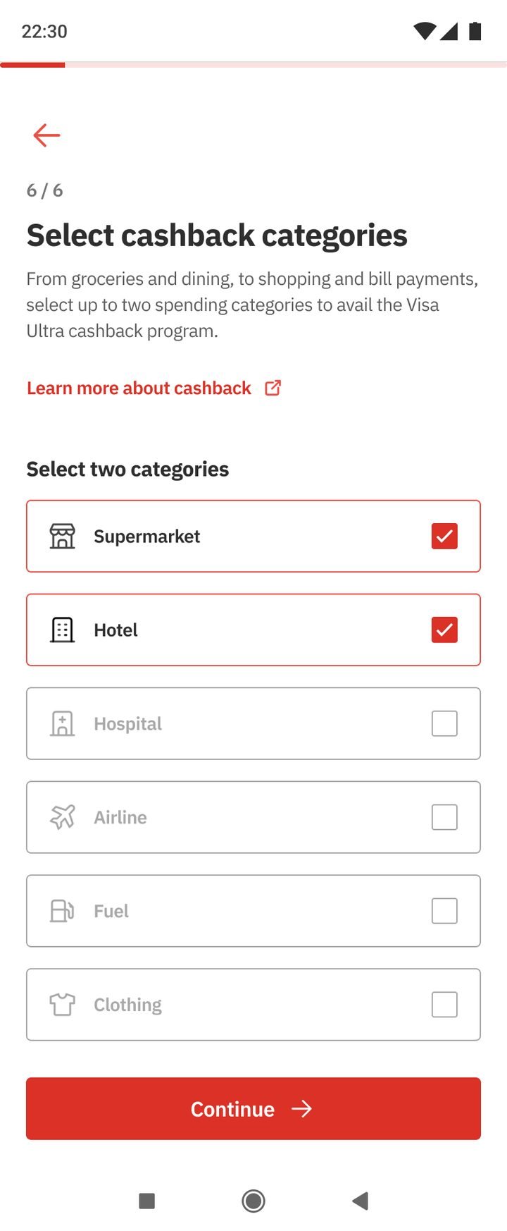
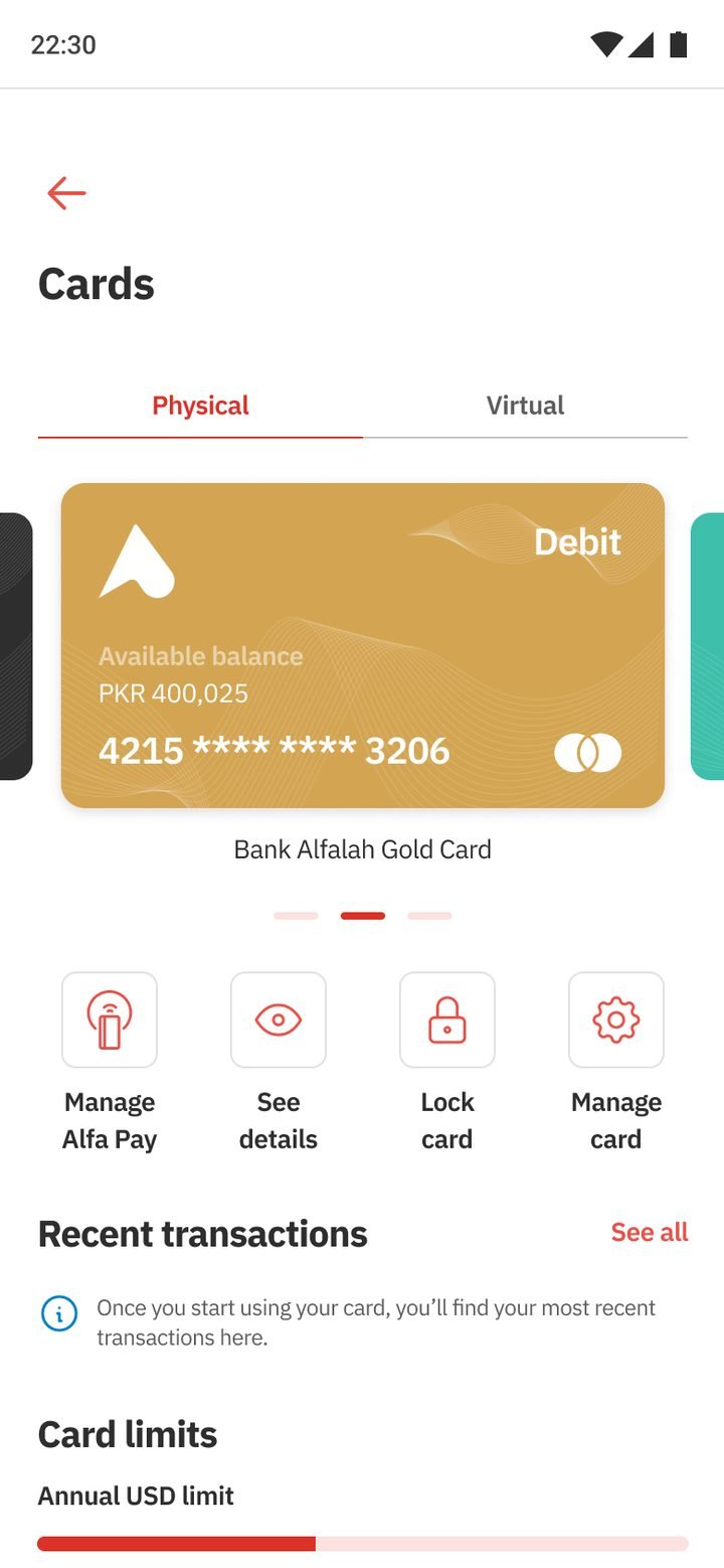
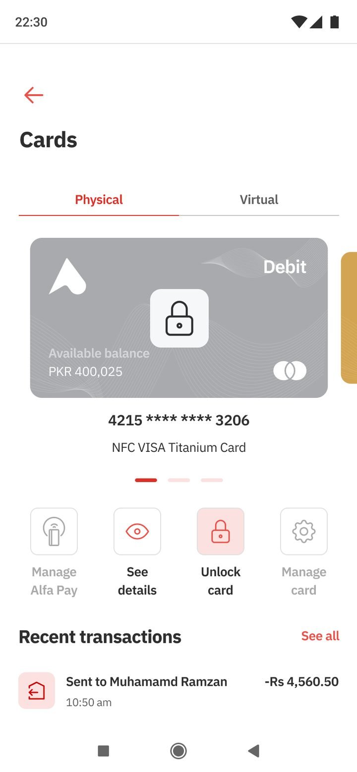
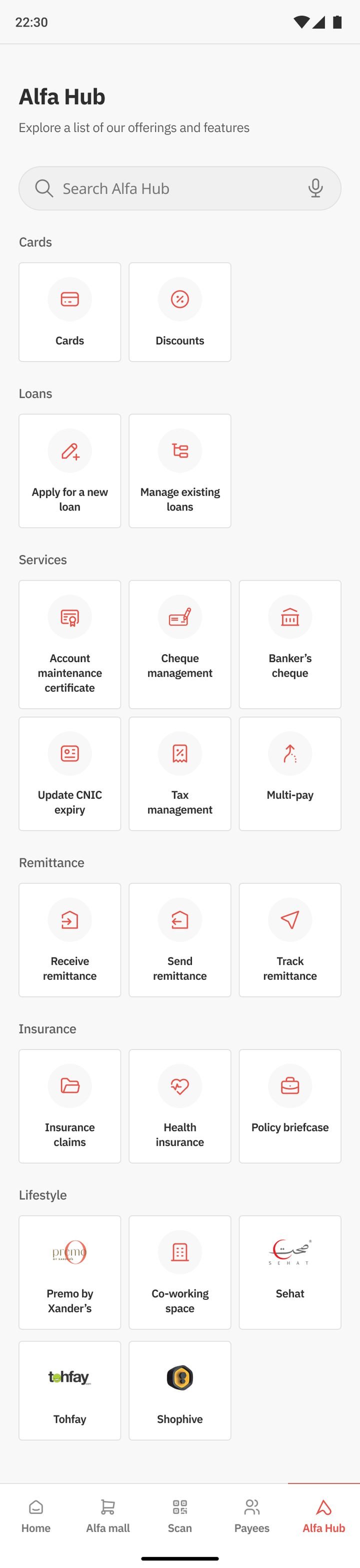
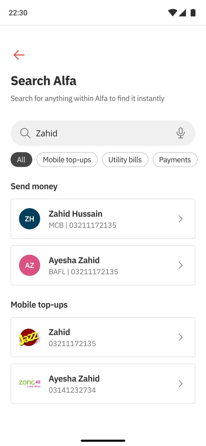
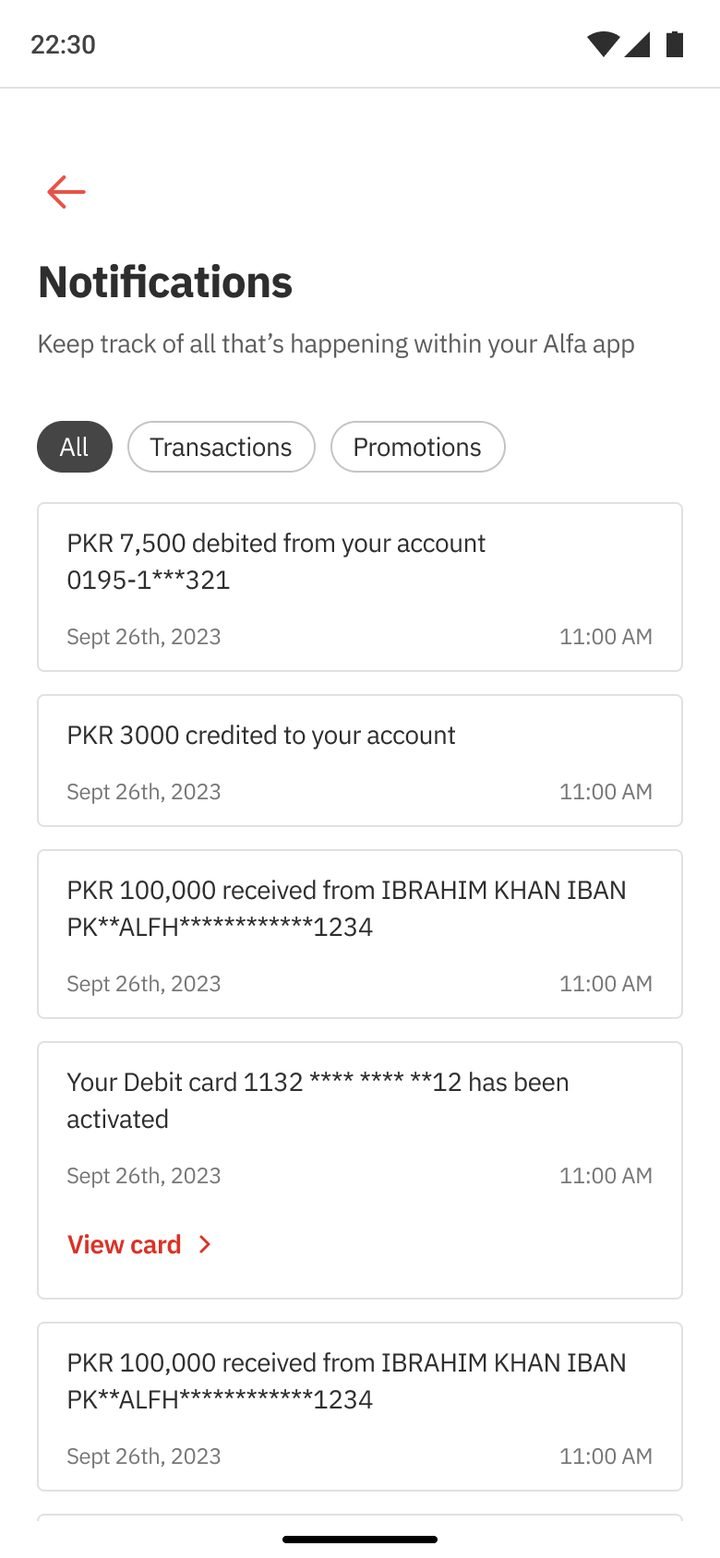
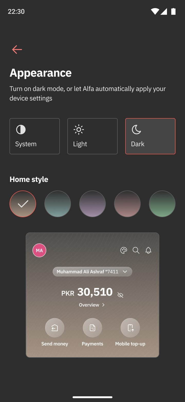
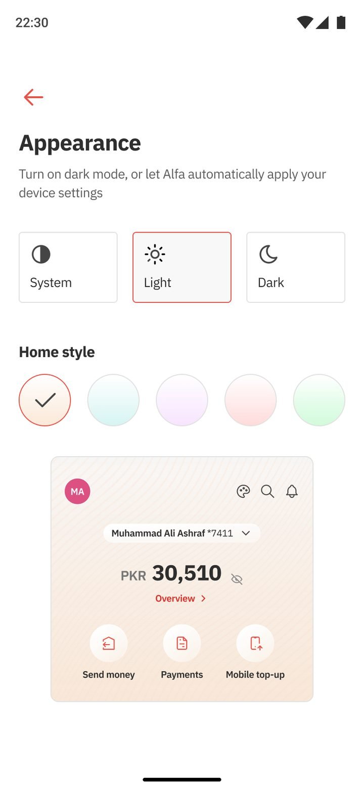
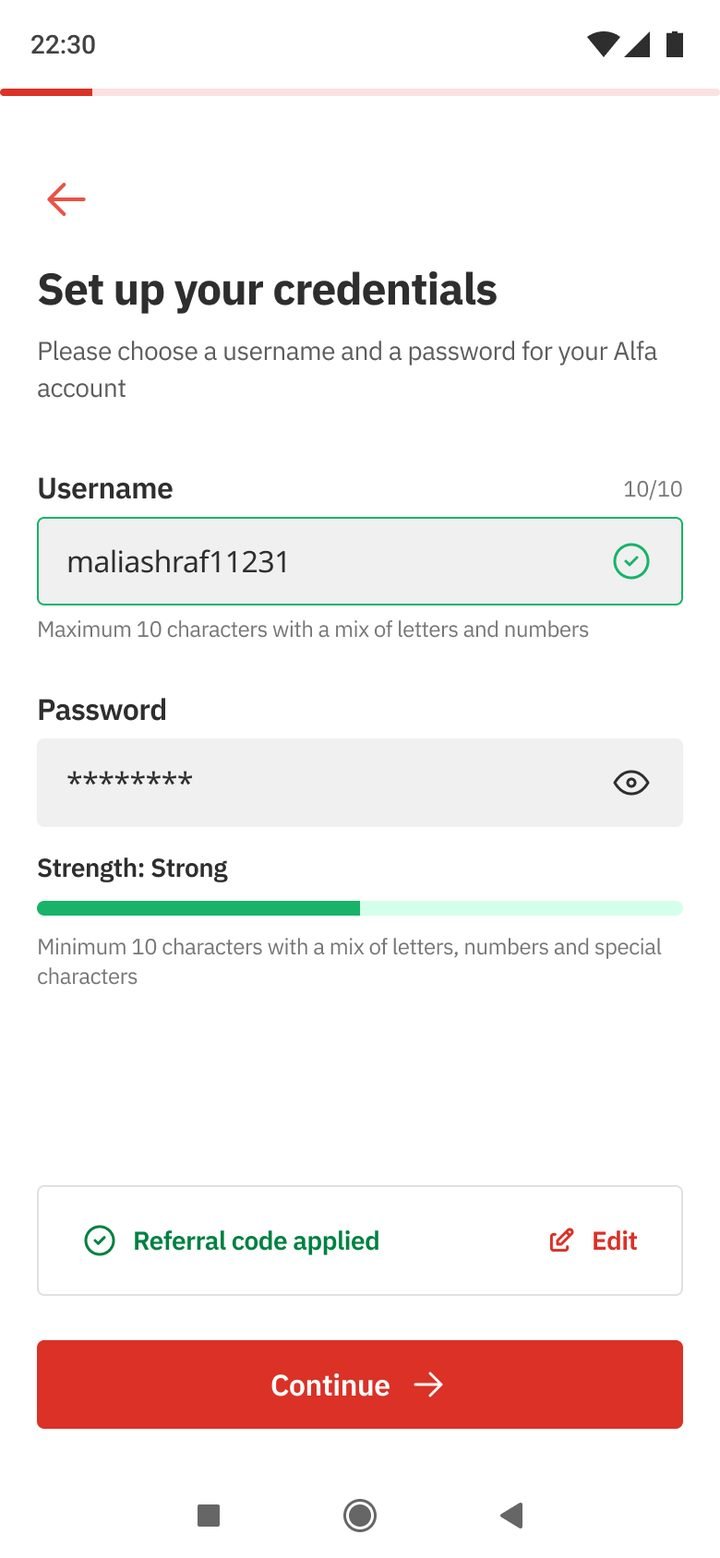
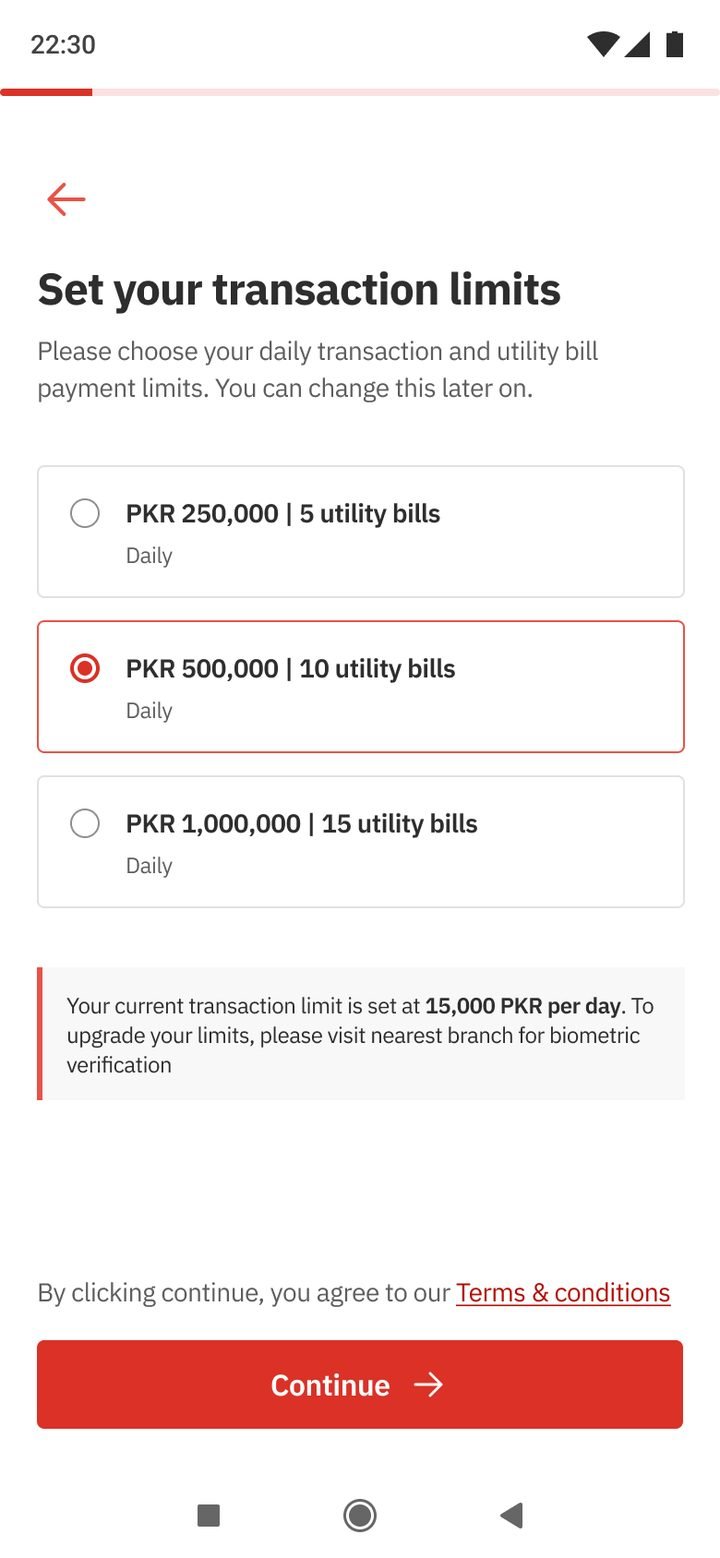
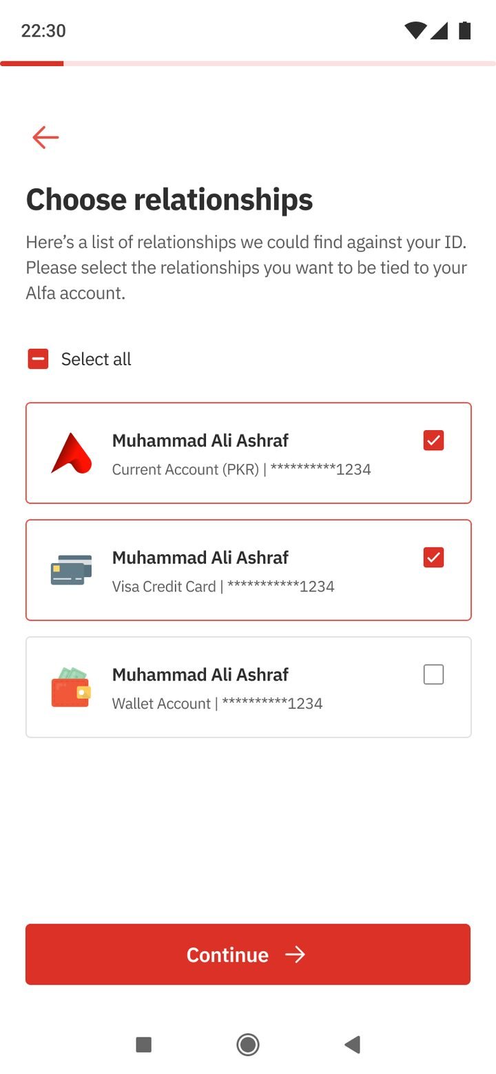
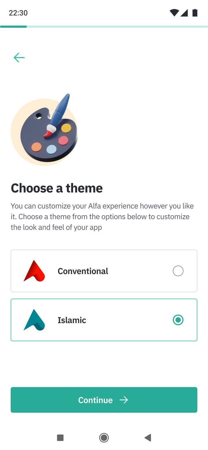
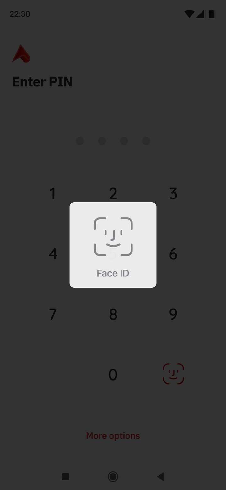
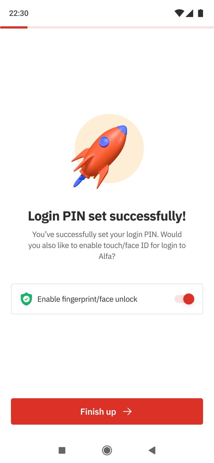
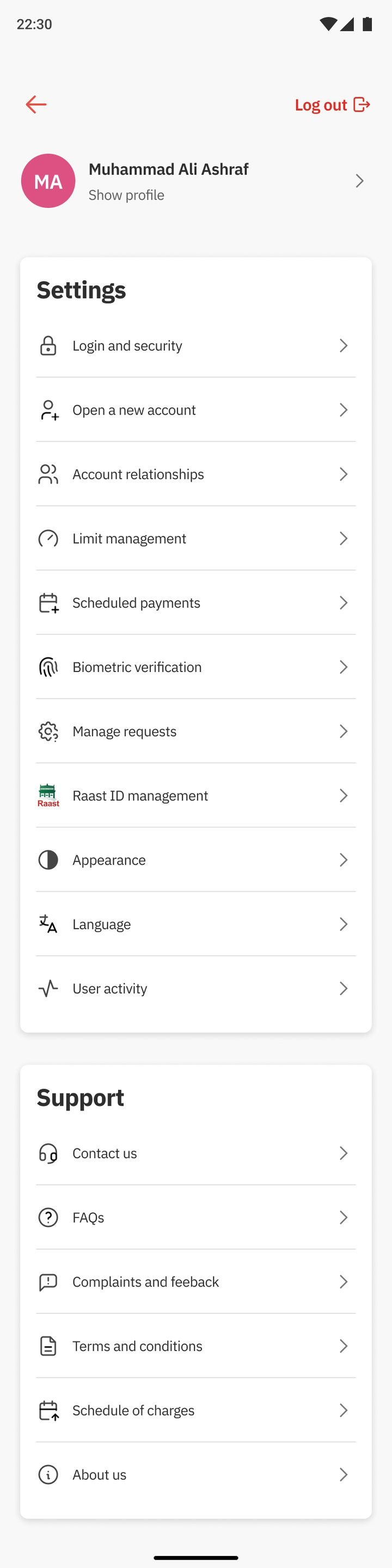
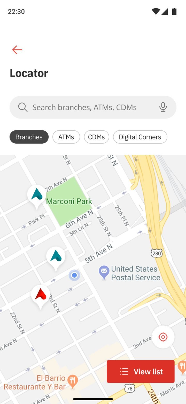
Balance first and private by default, with quick actions each customer chooses.
Read the use case →Opening an account and registering for Alfa, joined into a single path.
Read the use case →Bank, Raast and CNIC transfers that all work the same way.
Read the use case →Gen 3 screens are from the flagship design file. The design system was built with external consultants. The UX underneath carries much of our earlier work, and the core team took it to launch after I left.
Beautiful mockups rarely reveal the hard part. Real product design happened inside conversations, disagreements, constraints and trade-offs, and it left me with a few principles I still design by.
Security protects people. Confusion scares them.
OTPs, biometrics, device checks and approvals all add friction. The job wasn’t removing them. It was helping people understand why they exist.
Technically complete isn’t emotionally complete.
A payment isn’t done when the server says so. It’s done when the customer feels sure it arrived, with a receipt, a reference and a next step.
Design for someone’s worst day.
Lost cards, fraud and locked accounts. The flows used least often are the ones people need to work first time, under pressure.
Compliance wasn’t the obstacle. It was protecting customers too.
Once I saw that, product conversations changed. Design stopped defending pixels and started defending people, together.
People I designed with every day:
Five years later, I realised it means reducing uncertainty.
Not removing complexity. Not adding features. Helping people move forward with confidence, helping businesses make better decisions, and helping engineers build clearer solutions. That philosophy still guides every product I design.
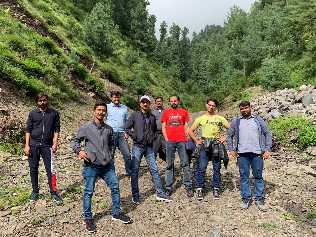
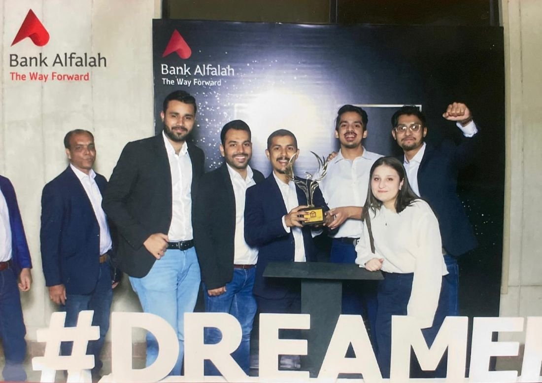
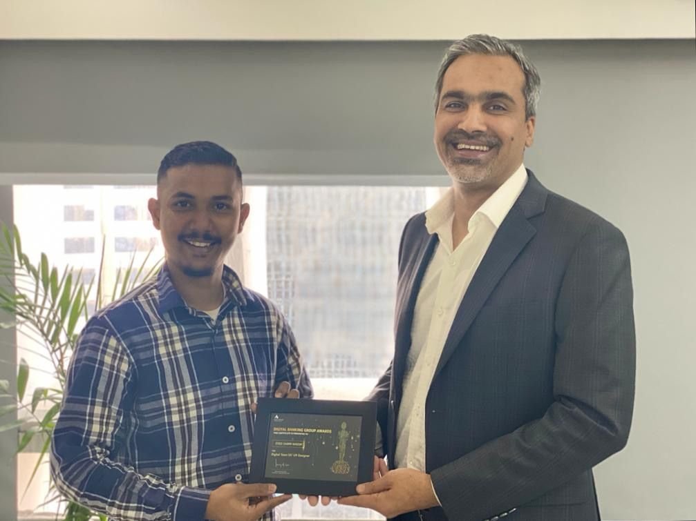
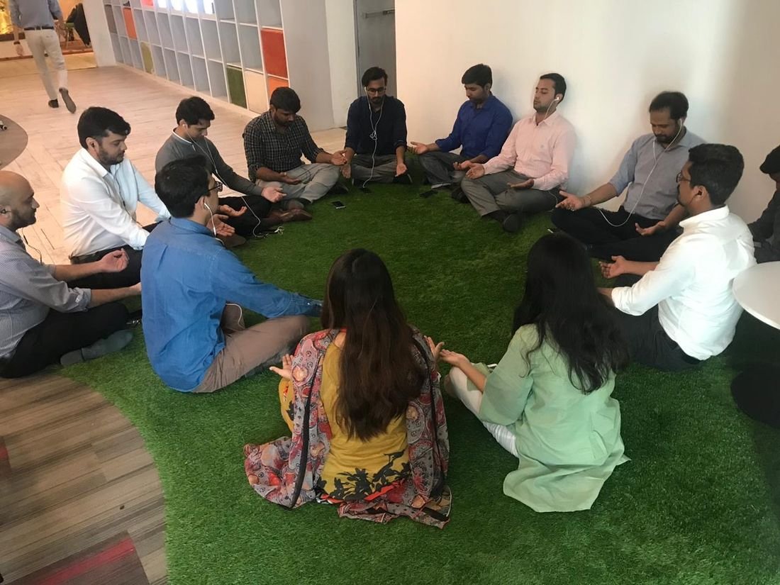
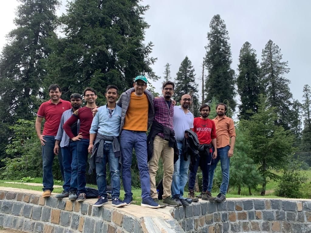
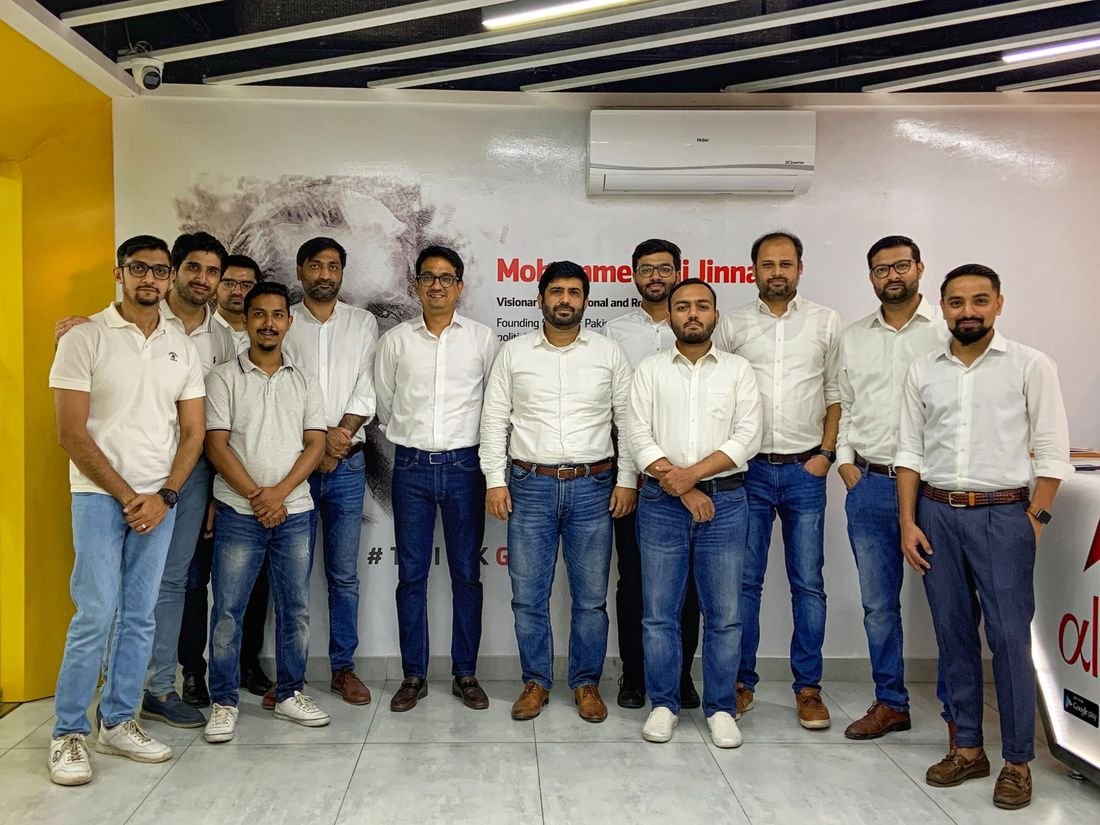
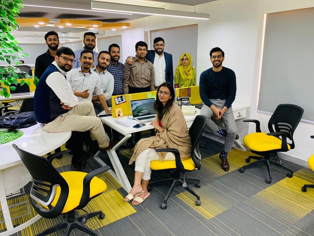
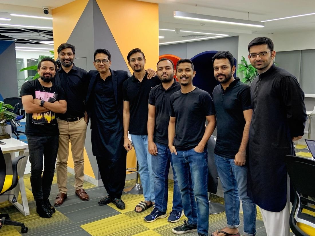
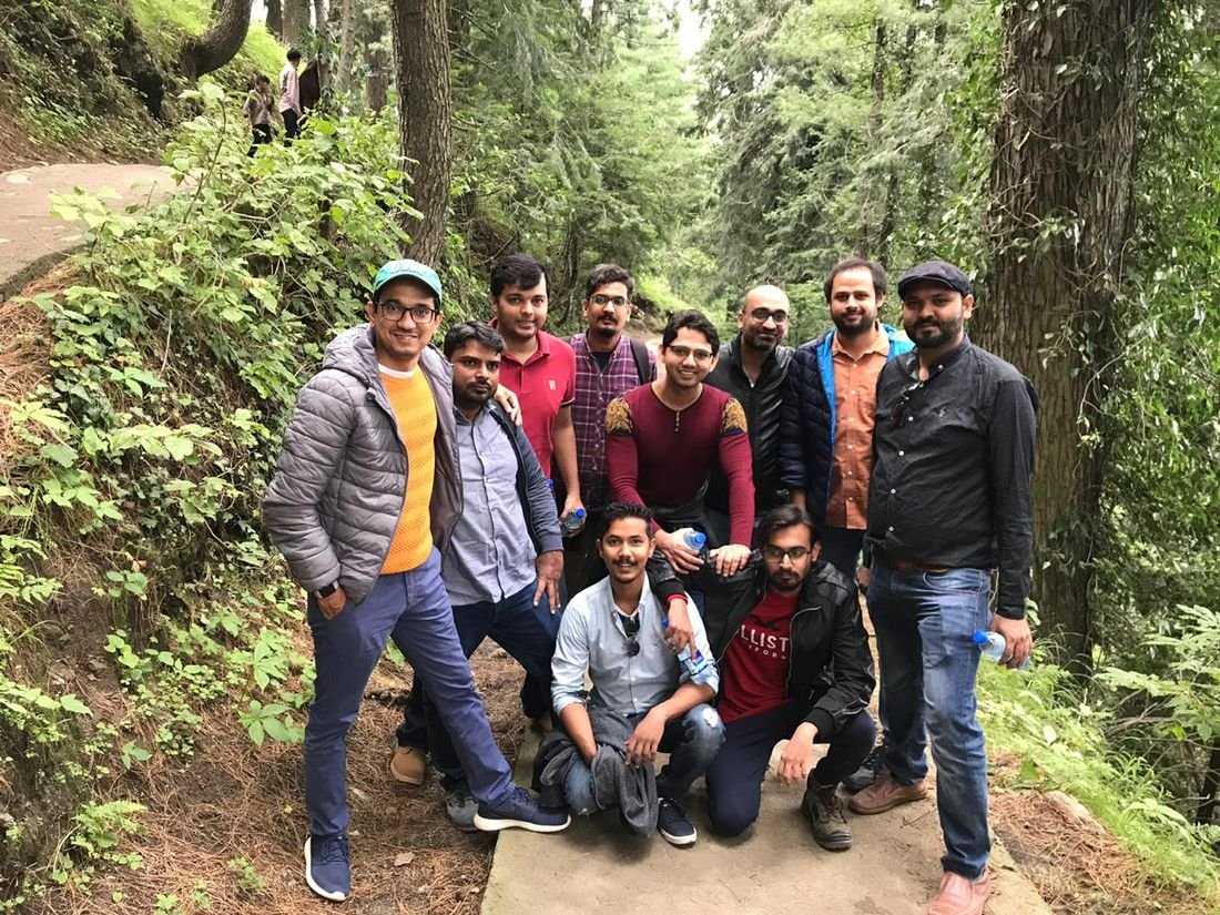
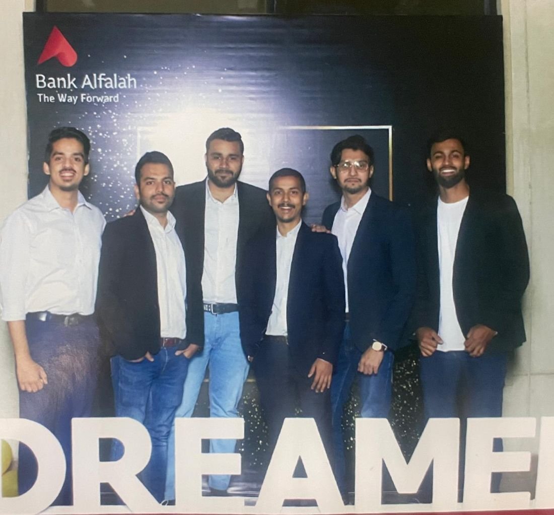
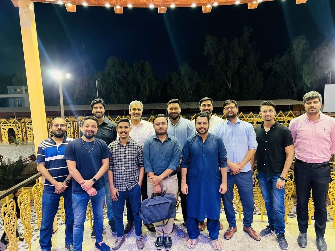
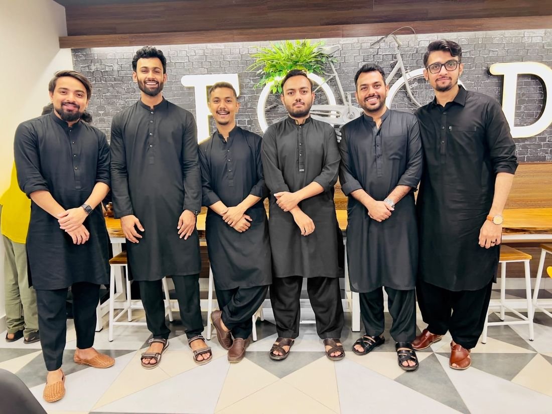
Five years at a bank is also trips up north, award nights, dress-code days and a lot of chai. These are the people who made the hard sprints feel easy. Drag the photos around.


I didn’t spend five years designing a banking app.Alfa · Bank Alfalah · 2018 — 2023
I spent five years designing confidence.
This case study is intentionally unfinished. Every major product leaves behind stories that deserve to be told properly, so I’ll keep writing them here.