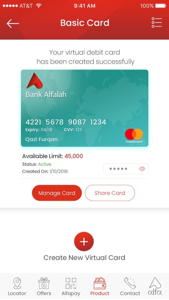
Open the home to everyone
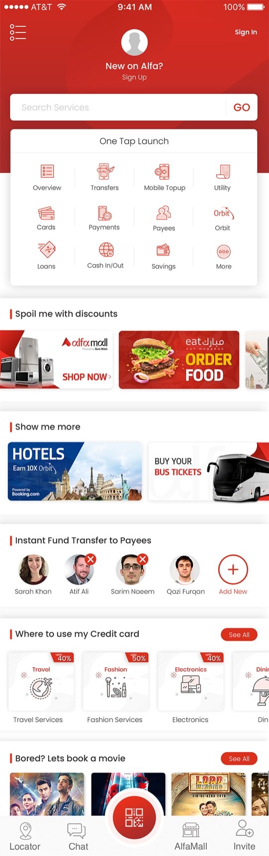
The logged-out home shows the full one-tap launch grid, offers and lifestyle rails. Anything that needs an account asks for it at the moment of intent, not at the front door.
 Sarim Naeem
A banking app with a login wall only serves people who already chose you. The Open App let anyone explore Alfa first, and gave them clear, well-timed doors into registration.
In the agency app, nothing was visible until you had registered and logged in. People who downloaded Alfa out of curiosity, or because a friend mentioned it, met a form before they met the product.
The business wanted new customers. The app was only built for existing ones.
The logged-out home shows the full one-tap launch grid, offers and lifestyle rails. Anything that needs an account asks for it at the moment of intent, not at the front door.
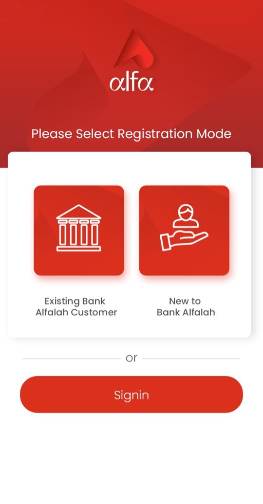
Registration starts with one clear question: are you already an Alfalah customer, or new to the bank? Each path then asks only what it needs.
Registered customers get a remembered, personalised login with a 4-digit PIN option, so opening the app to check a balance stays quick.
“New on Alfa? Sign up” sits in the header, and every locked feature routes into registration, so the ask always has context.
Drag or scroll sideways, and tap any screen to see it larger.
Alfa brand moment on launch.
Browse everything without an account.
Existing customer or new to bank.
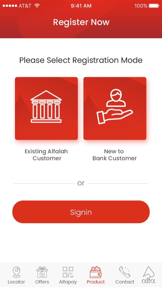
Sign in or start registering.
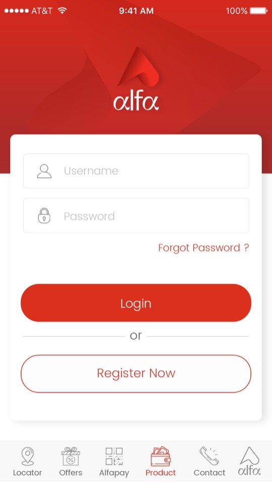
Username, password or social.
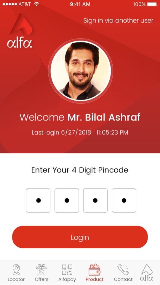
Returning users, one step.
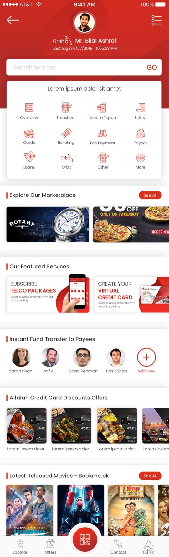
The same home, now yours.
← Drag to follow the flow →