One plot, clearly fenced
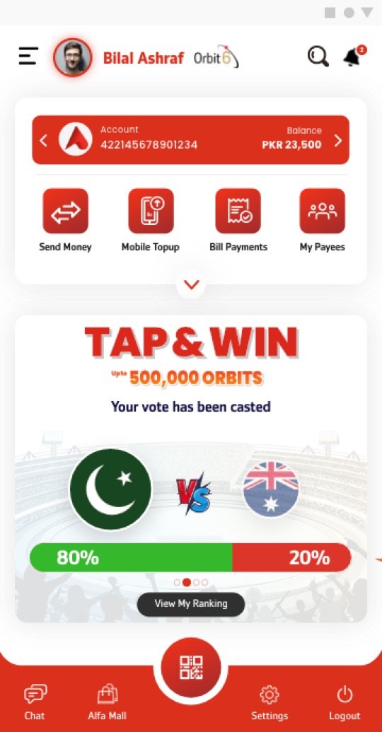
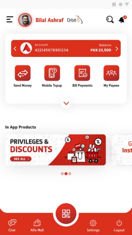
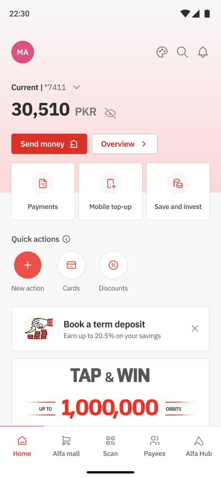
Promotions lived in a single carousel below the account card and daily actions. They never pushed everyday tasks down or took over the screen.
 Sarim Naeem
Every business team wanted a place on Alfa’s home screen. Instead of saying yes to everyone, or no to everyone, we treated the banner carousel like property, with limited space, clear rules and one design standard.
Our Digital Channels team owned Alfa. Around us sat a department full of stakeholders, each with business targets: cards, loans, deposits, remittance, insurance, and lifestyle partners like Vouch365, foodpanda and Booking.com. All of them wanted the same thing: to be seen by the people opening the app every day.
If every request became a new tile, popup or menu item, the home would collapse under its own promotions and the daily tasks would get buried. If we said no to everyone, the app would stop earning its keep for the bank.
We gave the home one marketing area, a sliding banner carousel, and treated it like property. Space was limited, there were rules for using it, and every tenant got the same standard of design. Business teams brought us their campaigns, we designed the banners, and the carousel became the one place on the home where products competed for attention.
Promotions lived in a single carousel below the account card and daily actions. They never pushed everyday tasks down or took over the screen.
Business teams came to us with a campaign and a goal. We designed the banner, so quality and tone stayed consistent no matter who was promoting what.
Headline on the left, product visual on the right, the curved brand shape in between. A fixed template kept the carousel feeling like part of Alfa, not like ads.
Every banner was produced in Conventional red, Islamic teal and Premier gold, so it matched the theme of the customer seeing it.
One message and one action per banner: get a loan, order a cheque book, top up. Small enough to read at a glance on a phone.
A sample of the banners we designed for the home carousel.


















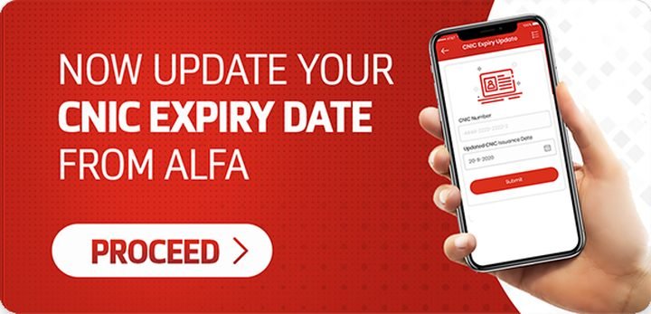





Switch themes to see how each campaign adapted for Conventional, Islamic and Premier customers.