Fragmented
WhatsApp groups, phone calls and roadside advice — no single place to ask for help.
 Sarim Naeem
What does a rider do when their motorcycle suddenly stops in the middle of nowhere?
That single question changed the direction of the product. Because the answer wasn’t another marketplace. It was a completely different user experience.
In Pakistan, motorcycles are more than just a mode of transport — they’re a lifeline. They’re how people get to work, make deliveries, attend university, and support their families.
Yet when something goes wrong, riders often rely on WhatsApp, phone calls, roadside recommendations, or simply pushing the bike until they find a mechanic.
WhatsApp groups, phone calls and roadside advice — no single place to ask for help.
Help is needed at the worst possible moment, often far from home and short on time.
Bike just died near Gulshan-e-Iqbal 😩7:42 PM ✓✓
Anyone know a mechanic nearby?7:42 PM ✓✓
Seen by 38Try the shop near the petrol pump, not sure if open7:51 PM
Which pump? How much will it cost?7:52 PM ✓
The status quo, dramatised — help by group chat.
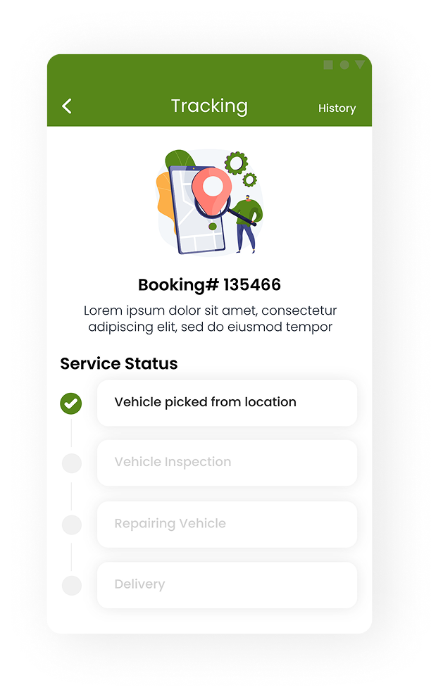
No way to know when — or whether — help would actually arrive.
Little confidence in pricing, service quality, or the mechanic who shows up.
“Posted in the bike group. Still waiting for someone to reply.”
“Called three numbers. One picked up. He’s forty minutes away.”
“A shopkeeper said there’s a mechanic somewhere near the market.”
“Pushing the bike. Hoping the next street has someone open.”
“He said one price on the phone and another when he arrived.”
“Is anyone actually coming? No one’s told me anything.”
Illustrative — written to capture the rider behaviours this project designed for.
The existing experience was fragmented, stressful, and unpredictable. The opportunity wasn’t to digitize workshops. It was to reduce uncertainty during one of the most frustrating moments a rider can experience.
Instead, I started thinking about human behaviour under stress. People behave differently during emergencies.
They don’t explore.
— so don’t make them navigateThey don’t compare.
— so don’t make them choose between tenThey don’t enjoy browsing.
— so don’t show them a catalogueProof that help is real, nearby and on the way.
Fewer steps between the problem and a mechanic.
One obvious thing to tap — not a menu to explore.
That insight shaped almost every design decision that followed.
MotoX wasn’t designed solely for emergencies. It also needed to support routine maintenance, spare parts, and long-term rider engagement. Merging these journeys into a single interface would have created unnecessary friction — so I separated the experience into two distinct mindsets.
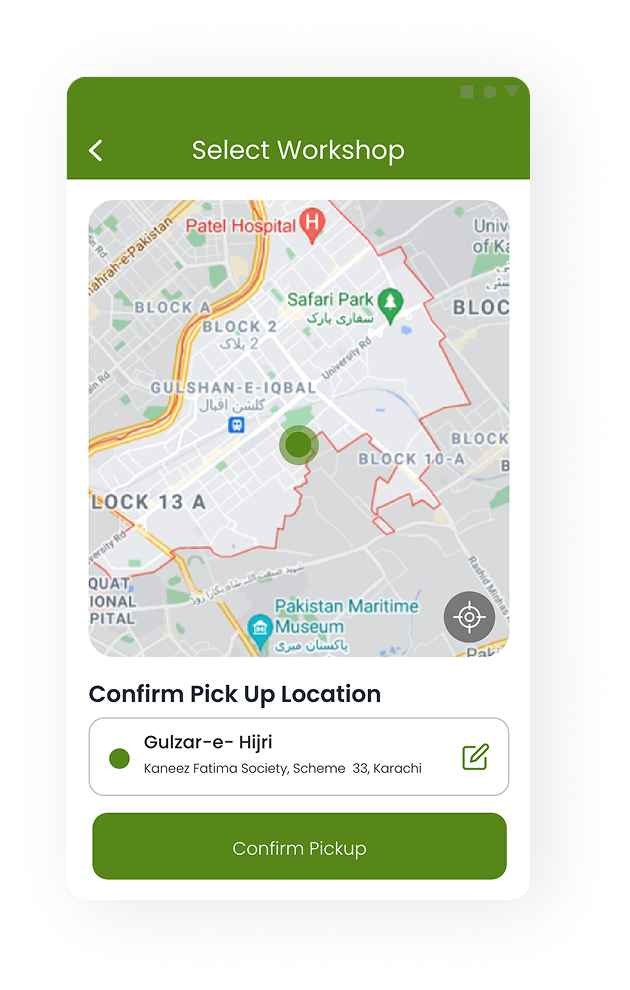
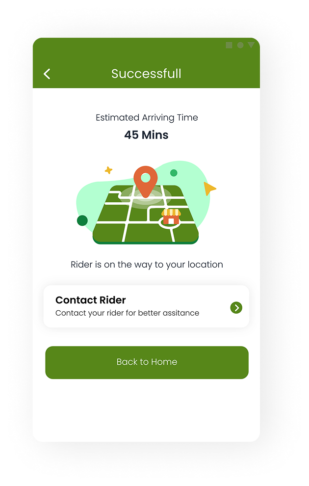
For riders dealing with an unexpected breakdown. The interface immediately prioritizes emergency assistance, nearby mechanics, live status updates, and transparent pricing — removing unnecessary decisions during a stressful moment.
For planned servicing, preventive maintenance, genuine spare parts, and workshop discovery. This journey encourages exploration because the user’s mindset is completely different.
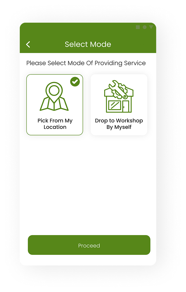
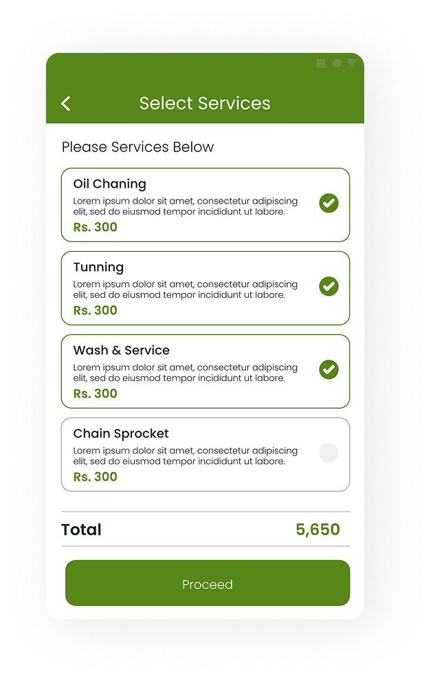
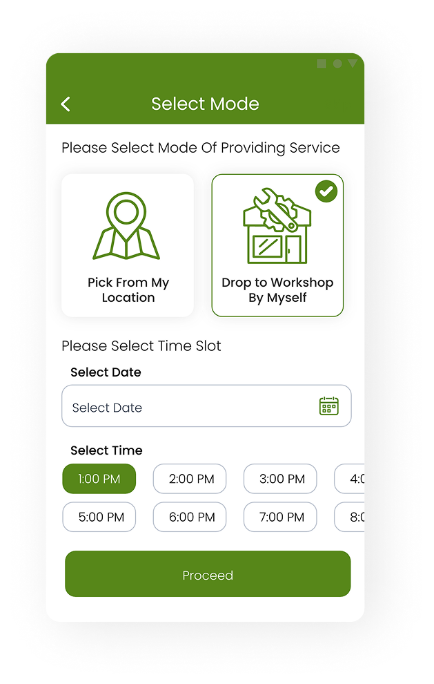
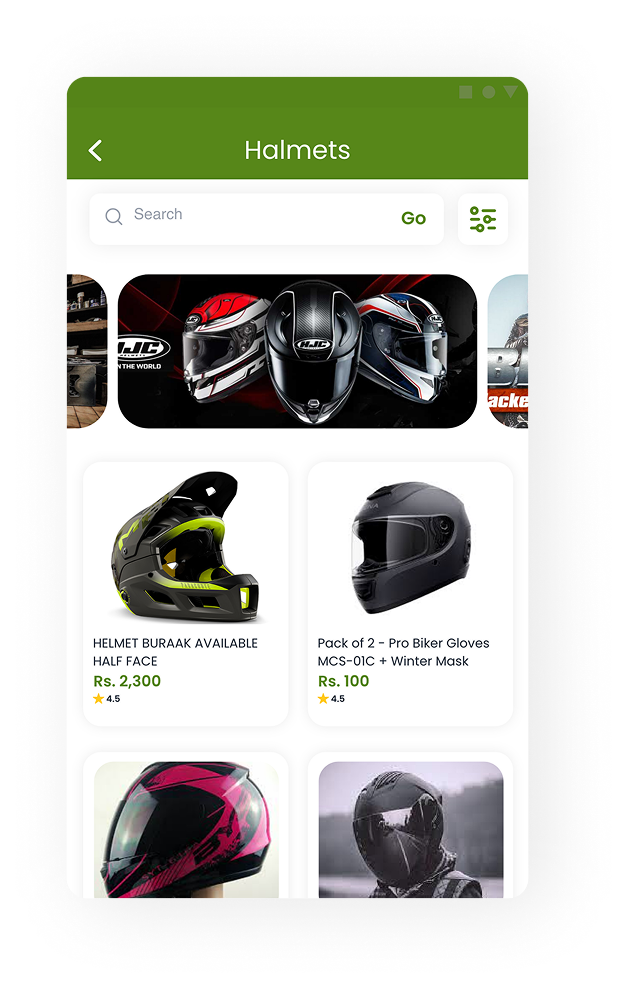
The product didn’t change. The user’s intent did.
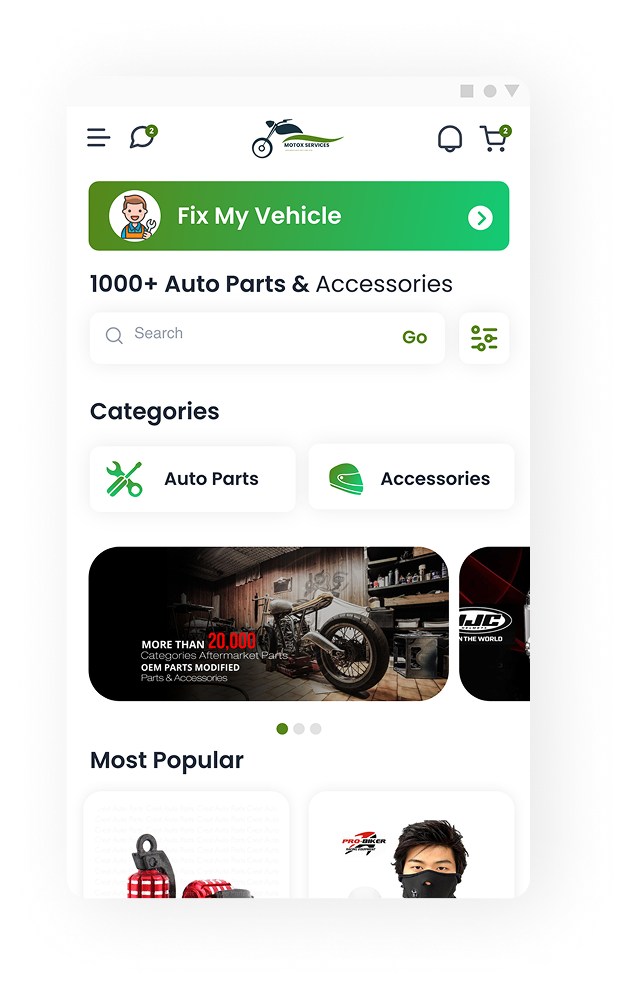
Initially, the homepage looked like a typical marketplace — categories, popular services, featured mechanics, promotions. Everything users would expect. But something felt wrong.
Imagine standing on the side of a highway with a punctured tyre.
So we removed everything that wasn’t immediately useful. Instead of asking users to navigate the product, the product immediately responded to why they opened it.
Tap to strip the marketplace down to what a stranded rider needs.
Sometimes the best UX decision isn’t adding another feature. It’s removing five.
Rather than relying solely on ratings, the experience emphasized signals that matter during emergencies.
Every interaction answered one question: “Can I trust what’s about to happen?”
Drag to follow the journey →
Emergency support became the emotional core of the experience, but MotoX was always envisioned as something bigger — a connected ecosystem for everything that comes after the first rescue.
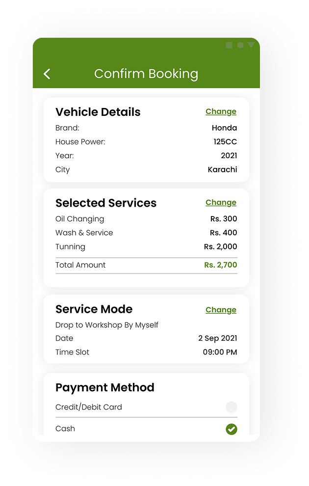
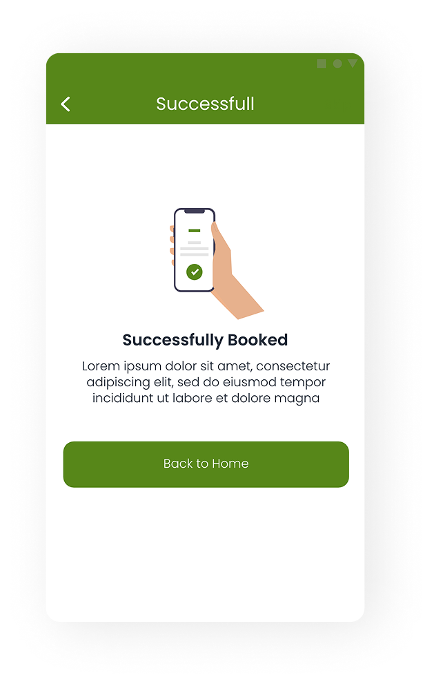
Pick your services, drop at a workshop or get picked up, choose a time.
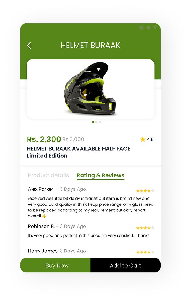
Helmets, gear and parts — with prices, ratings and reviews.
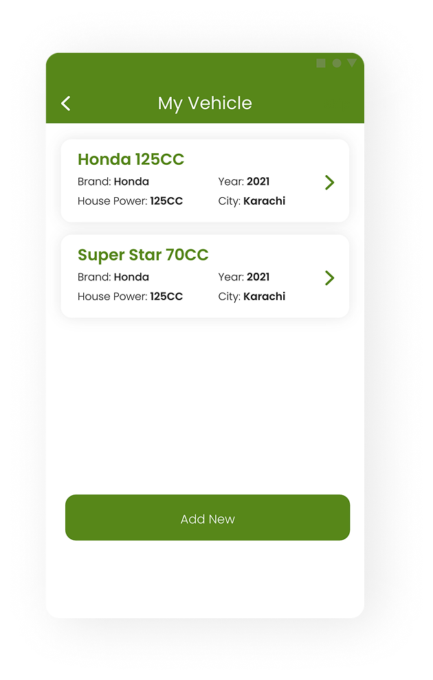
Every bike, its details and its past bookings in one place.
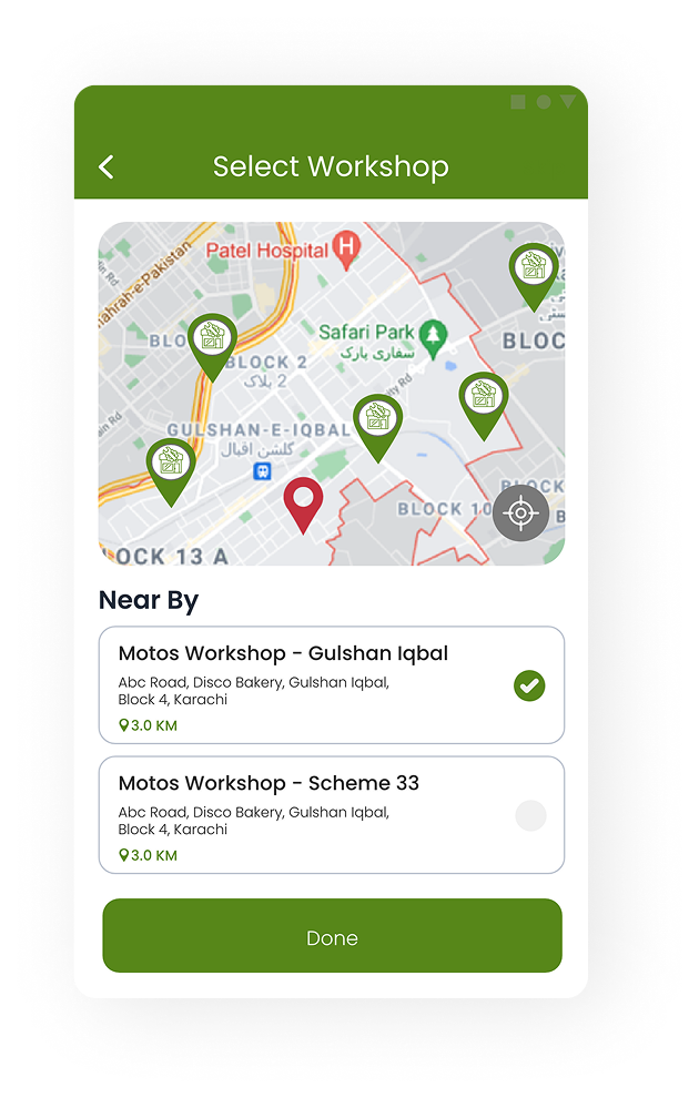
Nearby workshops on a map, with distance.
Reward points that give riders a reason to come back.
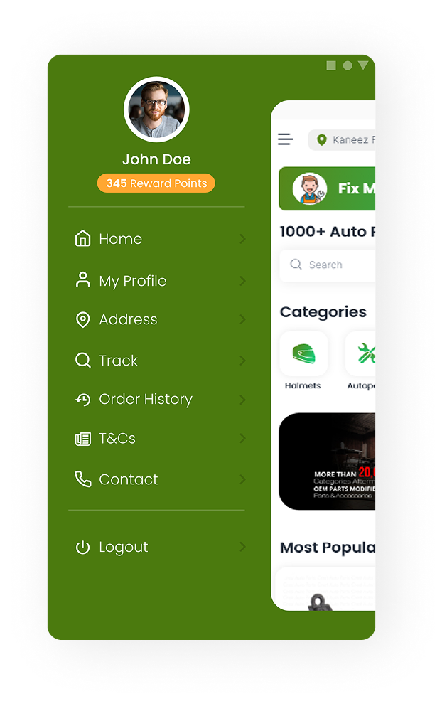
Instead of solving a single breakdown, the platform aimed to support the entire ownership journey.
Designing for urgency is fundamentally different from designing for convenience. The same user behaves differently depending on the situation they’re in. Recognizing that shift turned MotoX from a conventional service marketplace into a product that feels responsive, empathetic, and purpose-built for the moments that matter most.
Imagine the app recognizing recurring maintenance patterns based on mileage and service history, then proactively reminding riders before a breakdown occurs.
Your Honda 125 is running well. Next oil change in about 900 km.
The goal wouldn’t be to make roadside assistance faster. It would be to make it unnecessary.
I’m intentionally not filling this case study with screens like Login, Profile, Settings, or Order History. Those are expected in almost every app.
Instead, I’m highlighting the one idea I want you to remember: I redesigned the experience around the rider’s state of mind — not around the list of features.
Design for the moment,MotoX Services · Sarim Naeem
not the menu.