Outdated interaction patterns
The legacy UI hadn't moved since the platform's first release.
 Sarim Naeem
Bank Alfalah's Internet Banking was running on its legacy version — form-heavy, cluttered and disconnected from the modern Alfa app. I led a full UX reset, rebuilding it into a real-time financial control center.
Users could complete transactions, but never really see their money.
Bank Alfalah's Internet Banking was still running on the very first version of its web platform — form-heavy, cluttered, slow, and disconnected from the modern Alfa app. Users lacked clarity, instant financial visibility and easy access to the actions they performed every day.
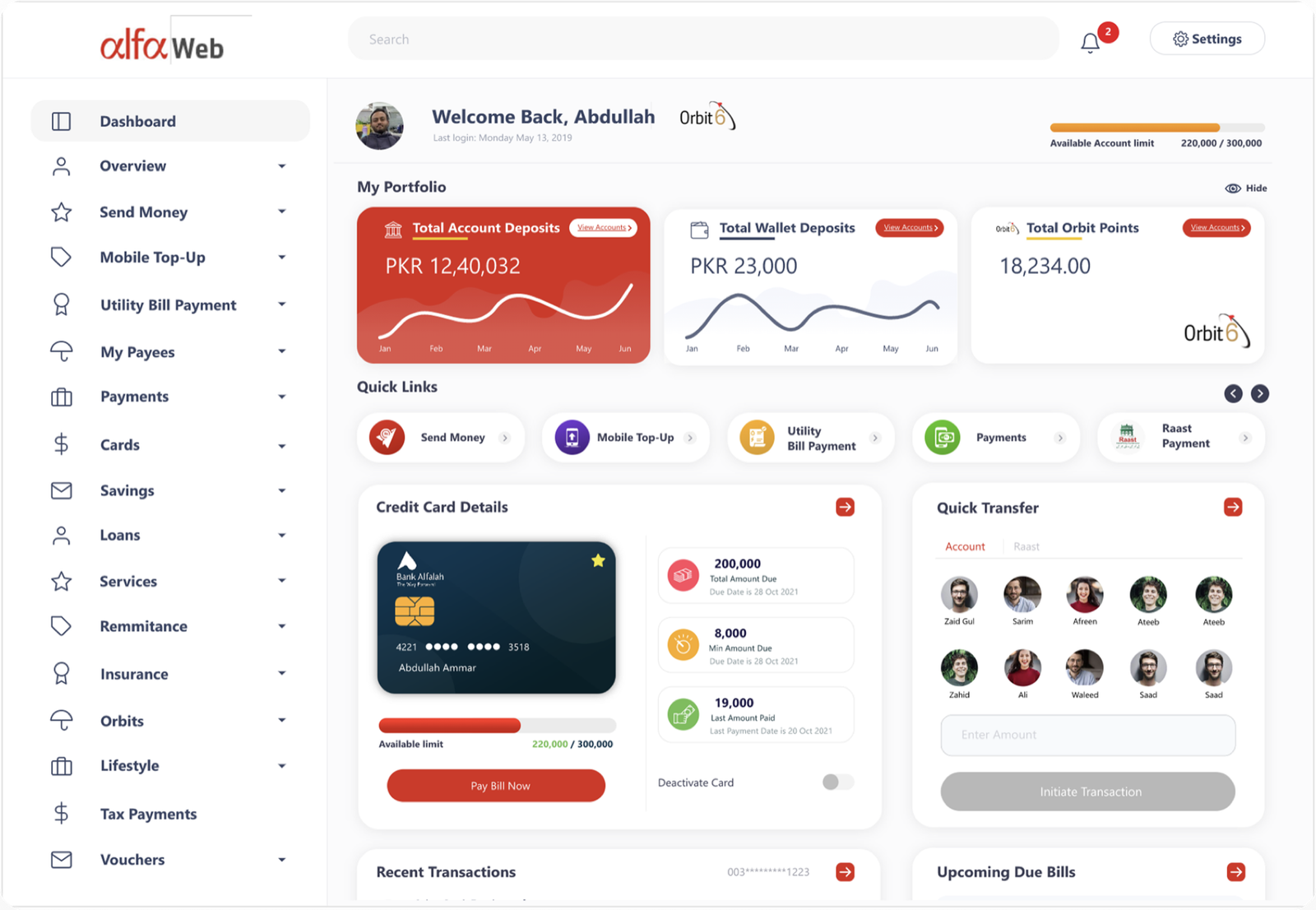
I led a full UX reset, rebuilding the dashboard from scratch. Key balances appear upfront, high-frequency actions are surfaced, and smart widgets offer quick transfers, recent activity and upcoming bills. A task-based sidebar makes the whole experience faster, clearer and more intuitive.
The goal wasn't a new coat of paint. It was turning a place to complete transactions into a place to understand your money.
The legacy UI hadn't moved since the platform's first release.
Frequent tasks were buried behind menus and weak navigation.
No control over how financial information was surfaced.
Modern, scalable, and built to support how people actually bank — every day.
The platform needed to support daily banking with clarity and speed, not just carry the old structure over with a fresh visual layer.
Map what was broken, then decide what the new dashboard must do.
I mapped the old platform's problems against the new dashboard's goals, then sketched an initial wireframe to define where financial summaries live and to prioritize quick actions and widgets. This low-fidelity layout aligned the team early and kept the new design modular and optimized for fast daily banking tasks.
Outdated UI, poor financial visibility, hidden key actions and heavy cognitive load — mapped directly against the new dashboard's goals.
Research artifact — old issues vs. new goals.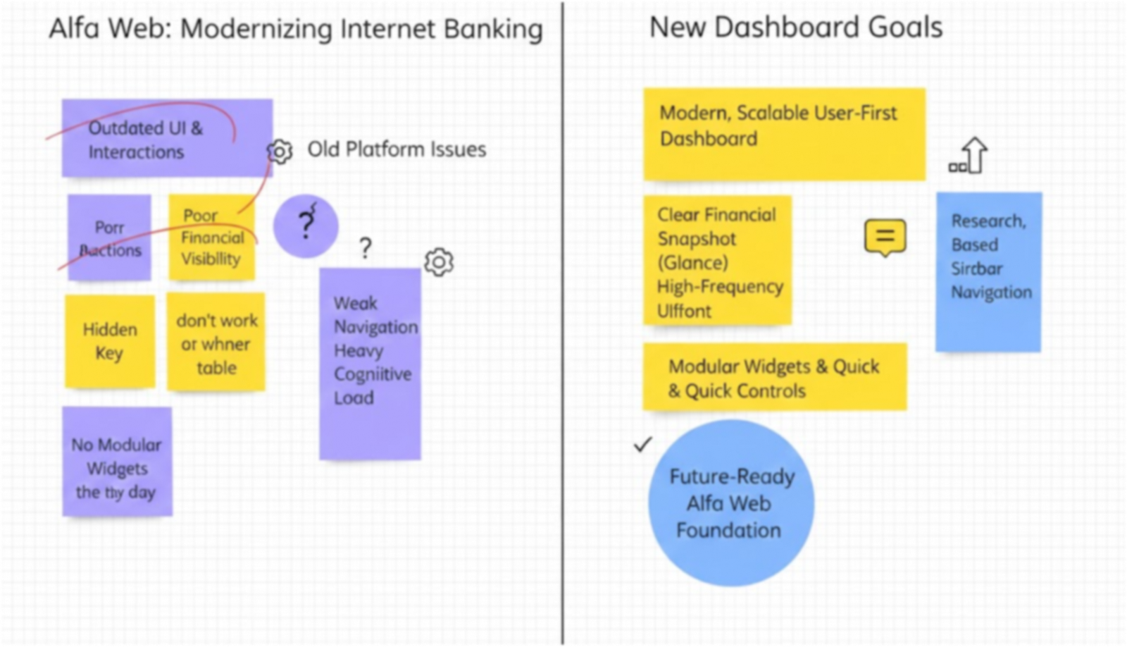
An initial wireframe mapped the dashboard structure and the placement of financial summaries, quick actions and widgets before any visual design began.
Design choice — agree on hierarchy before pixels.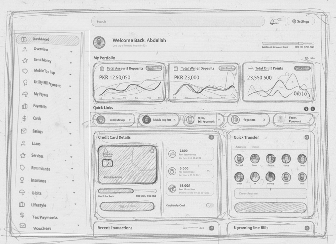
The old dashboard was dense, disconnected and slow to scan.
The redesign surfaces what matters first — balances, the most-used actions and live widgets — instead of asking users to dig through menus and tables to find them.
The very first version of Bank Alfalah's web platform. Everything had the same visual weight, so nothing stood out — including the user's own balance.
A real-time financial control center: a portfolio snapshot on top, quick links for daily tasks, and widgets for cards, transfers, transactions and bills.
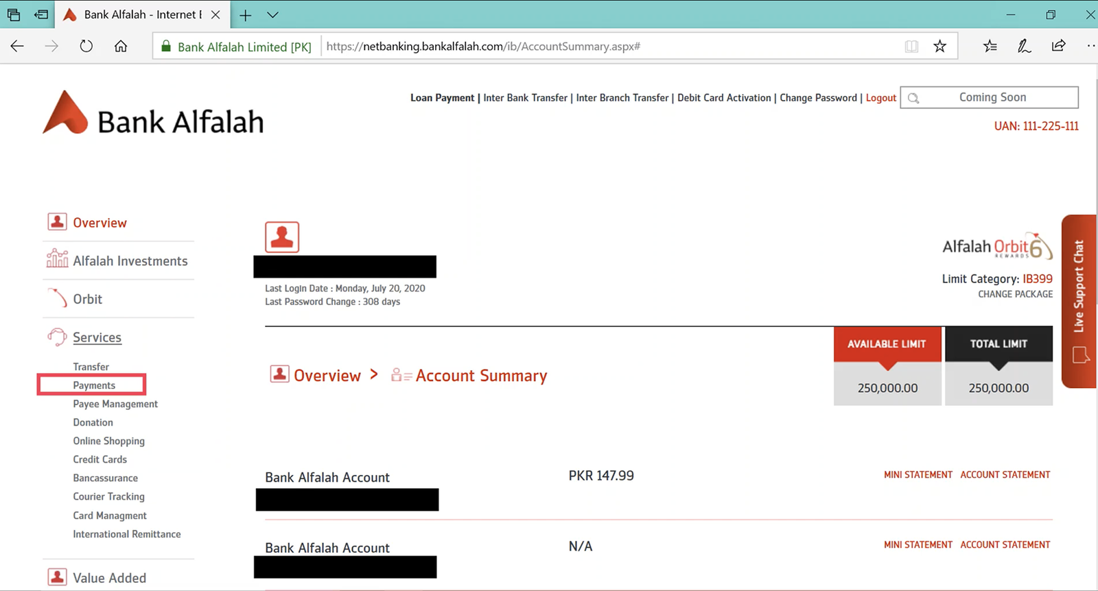
Each feature replaced a static, list-based pattern from the legacy platform with a dynamic, behavior-driven layout.
Account deposits, wallet balance, card limits and Orbit points come together in one consolidated view — an instant financial overview without page navigation, something entirely missing from the legacy experience.
Design choice — clarity before capability.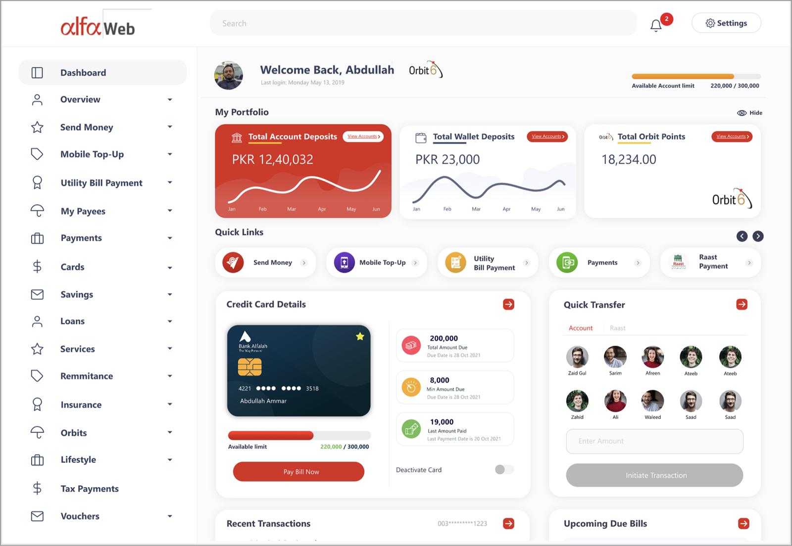
Send Money, Bill Payments and Mobile Top-Ups sit at the front of the experience, reducing reliance on menus and improving transaction speed and daily usability.
Design choice — fewer clicks to the most-used tasks.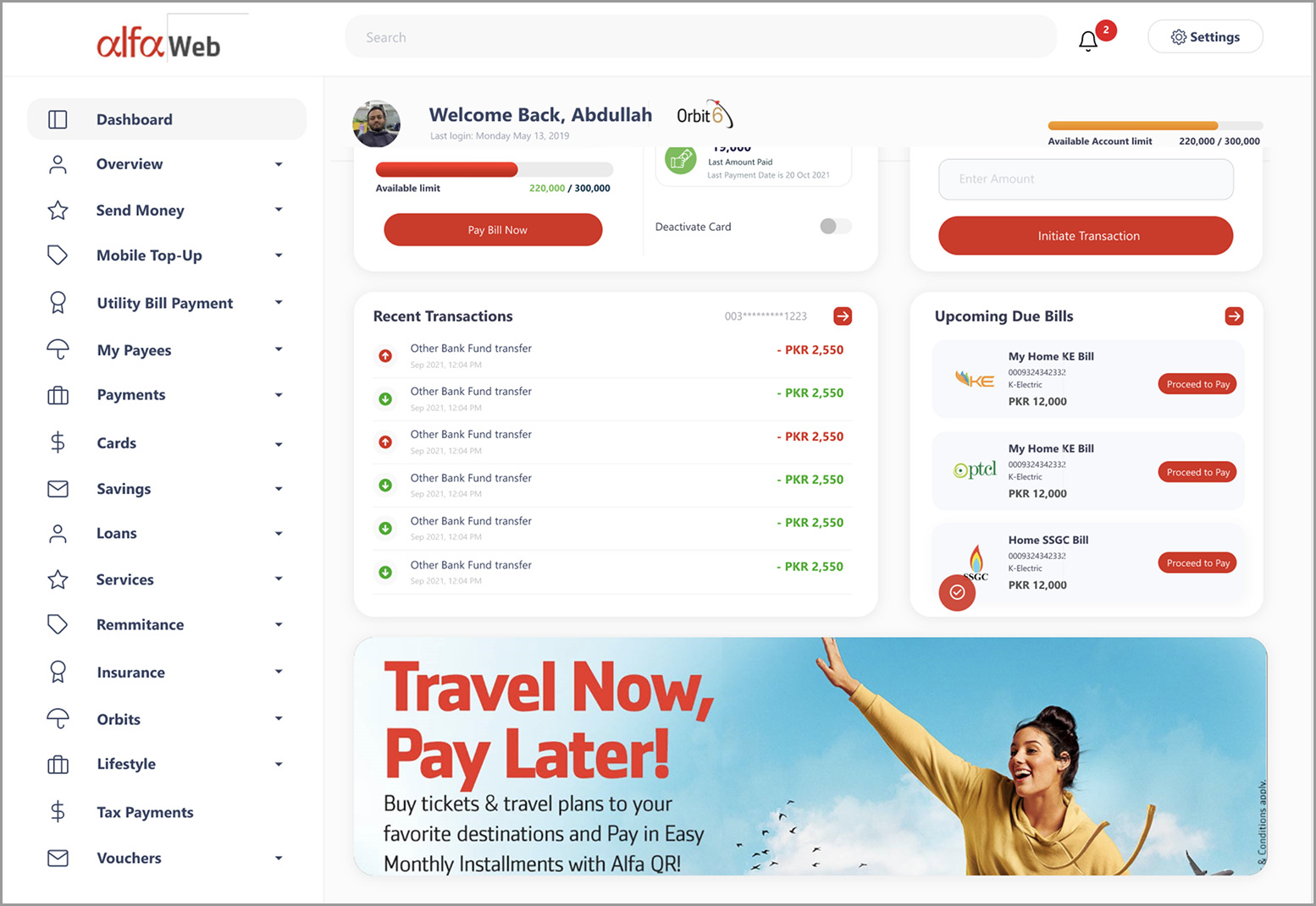
A new information architecture groups items by task, transactional flow and navigation priority — faster page discovery and a lower learning curve than the old cluttered sidebar.
Design choice — group by what users are trying to do.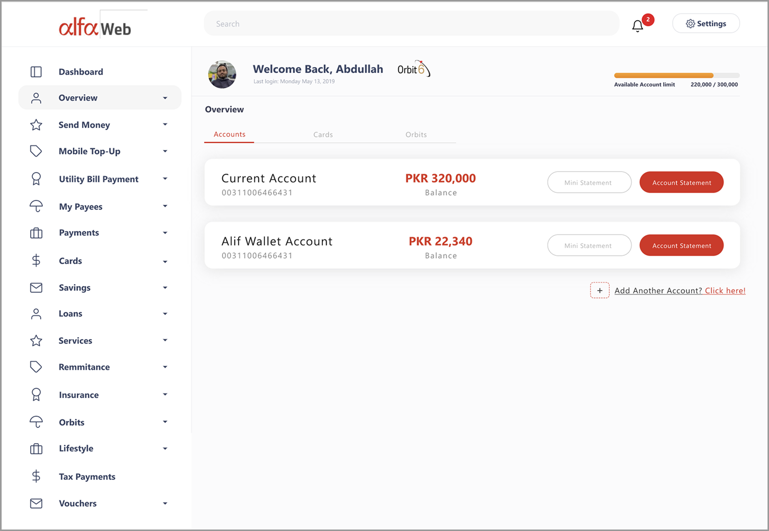
Widgets for card management, quick send to recent payees, transaction history and upcoming bills replace the static, list-based structure of the old system.
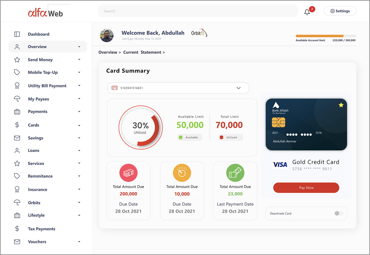
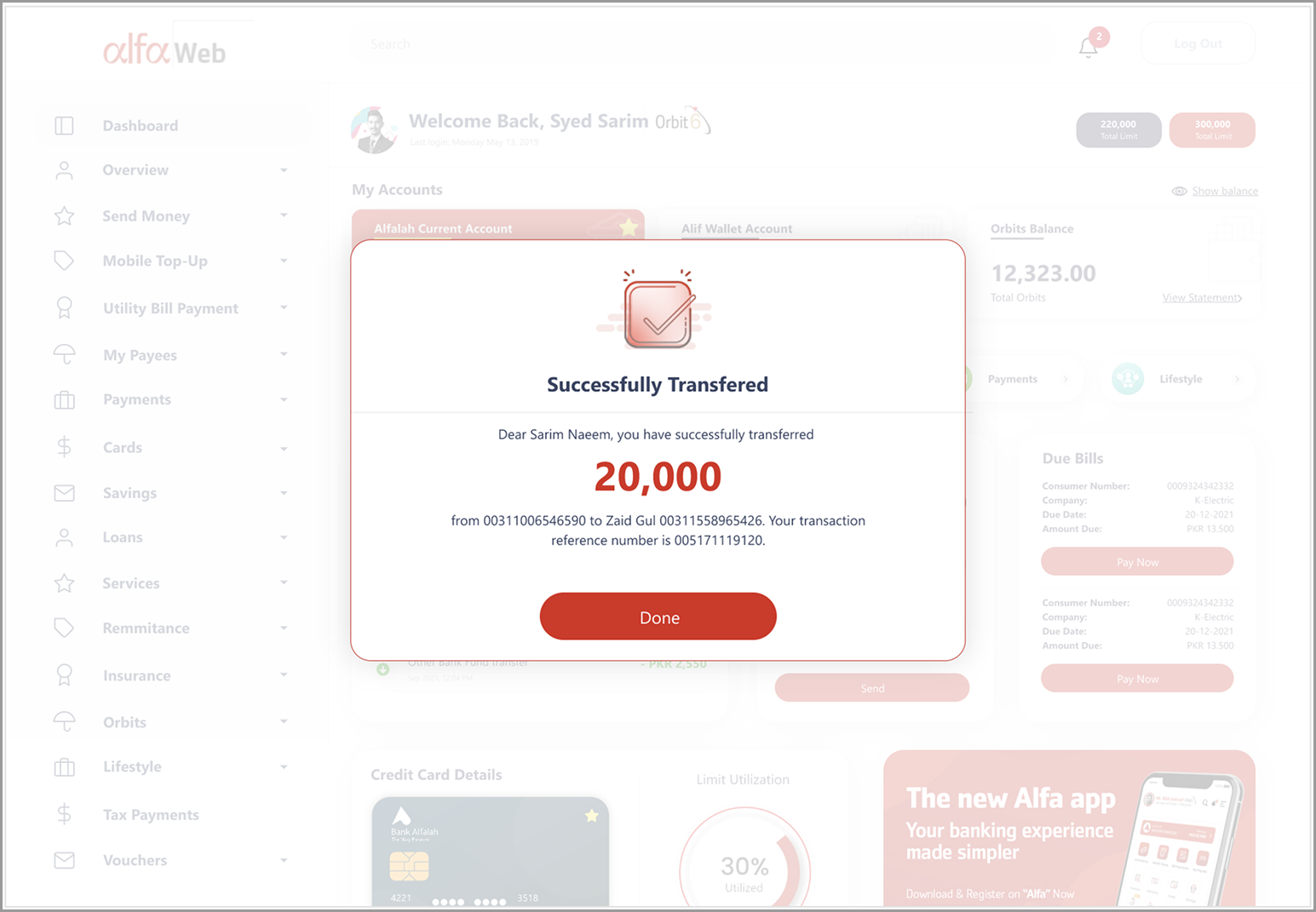
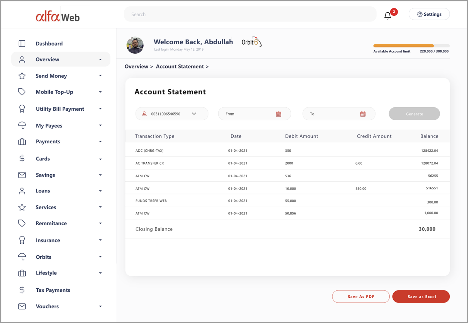
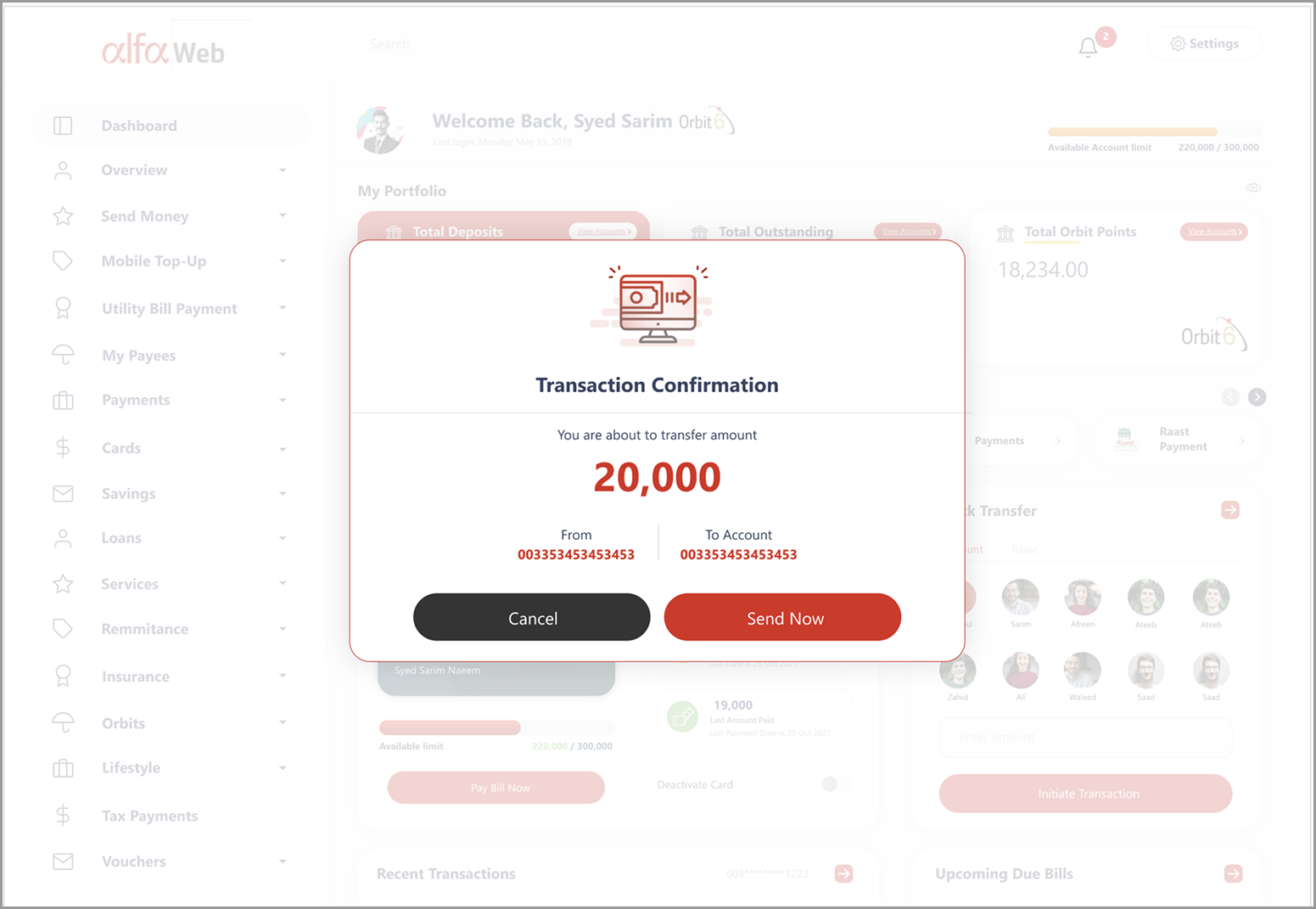
Design choice — widgets over static lists.A closer look at the surfaces that carry the redesign — from account statements to the send-money confirmation.
Statement balance, minimum due or a custom amount — the options users actually choose between, with the card's context kept on screen.
Design choice — defaults that match intent.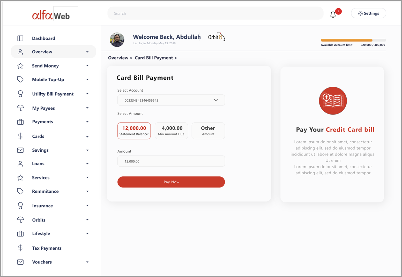
Built as a standalone concept, it went on to set the standard.
While the dashboard was designed as a standalone vision piece, it later became the benchmark for Alfa Web UI standards — fully aligned with the official Alfa Design System, and a scalable foundation for every inner banking page.
Became the reference point for Alfa Web UI standards.
Fully aligned with the official Alfa Design System.
A scalable foundation for every inner banking page.
Public metrics are confidential, but based on fintech UX benchmarks and internal feedback, the redesign led to faster transaction completion, better visibility of financial data, higher engagement with card and wallet features, and stronger trust through transparent financial snapshots.
Less navigation dependency across high-frequency tasks.
Balances, limits and bills visible without digging through menus.
Higher engagement with card and wallet features.
People don't open their bank to use features. They open it to know where they stand.
The dashboard structure is still live today — only iterated, never replaced. That longevity came from designing around daily habits rather than the bank's product catalogue.